Design Practicum @ oldweb.today

Going into our senior and junior years of design school, it was exciting to be able to work on a project that had as much cultural and professional significance as Rhizome’s Oldweb.Today internet archive. The archive pulled from historical sources dating as far back as the early 1990s to provide an interactive experience that approximates the experience of using the historical internet.

This project provided the opportunity to tackle various design problems in a real-world scenario in a way in which they could be understood and implemented in relation to one another. The challenges of this project encompassed everything from visual identity and branding to the user experience and interface design. During the course of the project, we spent time moving between groups each of which took a distinct approach to and interpretation of what an internet archive would look like in 2019.

We proposed three different visual identity systems and UI/UX scenarios with different code names that are all now under consideration by the design and development team of Rhizome. UI/UX scenarios are either developed on the front end or represented through mock-ups.

Throughout the process, we had multiple remote online real-time interactions with the Rhizome team, Pat Shiu, Lyndsey Jane Moulds and Mark Beasley and then had to chance to visit them at the New Museum for the second presentation of the project.


Solitaire

Working in the solitaire group we created a multi-surfaced mockup to help create better separation of information. This interface was based more on a retro look and used brighter colors to make the experience feel more light and fun. Solitaire’s color selection was based off of Rhizomes RGB color palette and other added colors stayed with the same tones. We created a new hierarchy for the timeline that better explains how the browsers work and what is the most optimal browser for the site and time you are searching. In the early stages, we decided that tabs like “commonly searched sites” and “user guides” would be helpful for people who are new to the site and may not have an idea of what to search first as well as to give a background of the website and help troubleshoot problems. 

The design of the interface of this approach emphasized the efficiency and accuracy of the tools that it provided users over simplicity or seamlessness. When designing the user interface, we tried to focus on the chronological flow of user inputs that were required to request a webpage from the archive.


The branding of this page was based on the concept of popup windows layering on top of each other; an effect that was common in the early days of the internet with its lax security standards and primitive advertising techniques.

The colors were taken from the Rhizome glitch effect, evoking that same feeling from the initial company to their product. These colors were also expanded to the whole website creating a more out there stark design that can be contrasted to their more subtle approach.
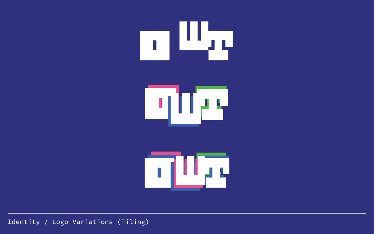
Dot.

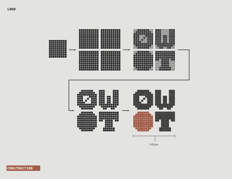
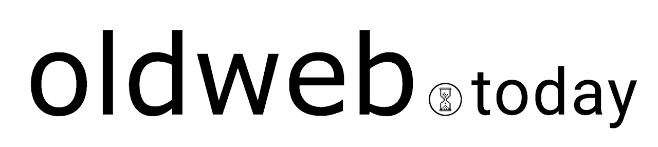
Oldweb.Today, ya can’t have it without the dot. 
Based off a 10×10 grid, our logo speaks both to the history of the web, as well as OWT’s origins in New York. Through systematic removal of pixels, the letterforms become less choppy as they go from O to W to T, bringing the old web to today. The colors of the site are muted and largely greys to allow the emulated content to be the main focus. Typefaces were handled in a similar way, using simple fonts that don’t dominate the screen and are easily legible. 
Our goal in the UI was the accessibility and ease of use. Through an intuitive calendar-like timeline, users can be sure their searches are accurate. Once all the information has been selected, users are drawn to the emulated browser that takes up much of the screen.

Much of the idea behind the Dot logo and its branding has to do with systems, and how they work. The logo itself was rendered by following a set of rules. Our approach was reductive and somewhat minimalist in how we felt functionality should be emphasized instead of decoration. A strength of the finished product is how it speaks to internet functionality of both the past and present, no matter what time period.

Web.Safe

The goal of this web space was to bring the slick design of the modern world to the passing fun and in your face aesthetics of the late 90s/early 2000s. Contrasting between old school fonts, web safe ties together the past and modern present into a GIF-able to be transformed and separated by a time loading hourglass further delineating the past, present, and future.

The idea for the brand identity for web-safe revolves around juxtaposing six of the original web-safe fonts like Arial, Palatino, Impact, Verdana, courier new and Comic Sans with a more modern one (in this case Roboto). The “.today” part of the logo stays in Roboto while the “OldWeb” half constantly changes into one of the six web-safe fonts. The dot that separates the two halves shows a Windows 98-era hourglass icon. There are possibilities for rapid animation of the logo or perhaps randomizing which font shows up for its first half upon refreshing the page or re-entering the site.

Neue Machina was chosen as a secondary font to be used for the printed matters of Oldweb.today, due to the deep ink traps that give it a mechanical and industrial aesthetic, yet rendered beautifully in ink.

The choice of a black, white, gray, and an HTML blue color palette stemmed from the default hyperlink blue that stems from the old web, and still can be visible in non-updated websites. While keeping the palette monochrome with one color standing out, this renders the attention of the audience to focus on the content as opposed to making a grander design.

Practicum Class of Spring 2019

Jeffrey Gardner
Daniel Gilmartin
Weronika Korzec
Tyler Lee
Joel Novas
Fred Quayenortey
Matthew Simonetti
James Zerilli
Sarah Rim
Ana Filomeno
Senary Chapman
Richard Siggillino

Vita Activa: The Spirit of Hannah Arendt

Vita Activa: The Spirit of Hannah Arendt, a documentary film directed by Ada Ushpiz will be screened the week that follows in the spirit of this year’s theme Mobility.

Thursday, November 3, 2016, 6:30–8:30 P.M.
Room 110
MASON GROSS SCHOOL OF THE ARTS
CIVIC SQUARE AUDITORIUM
33 LIVINGSTON AVENUE – NEW BRUNSWICK, NJ

Pizza and Popcorn will be served. The screening will be followed by a discussion moderated by Ardele Lister, and joined by some members of the faculty.

Review: In ‘Vita Activa: The Spirit of Hannah Arendt,’ a Thinker More Relevant Than Ever

Recommended reading prior to the screening:
What is Freedom by Hannah Arendt
Reflections on Exile by Edward Said

Art in a State of Mobility

Mason Gross Presents 

Panel Discussion

ART IN A STATE OF MOBILITY

Tuesday, October 25, 2016, 5–7 P.M.
MASON GROSS SCHOOL OF THE ARTS
CIVIC SQUARE AUDITORIUM
33 LIVINGSTON AVENUE – NEW BRUNSWICK, NJ

Panelists:

Mirene Arsanios
Mariam Ghani
Daniela Kostova

Modereated by:

Sara Raza

The theme of the panel organized for Fall 2016 is a response to the contemporary situation and discussions around the masses of people moving around the globe. Whether to seek greater economic or social opportunity, global warming or through forced migration due to conflict or persecution, 244 million people migrated across borders in 2015.

In Reflections on Exile Edward Said writes, “Modern Western culture is in large part the work of exiles, émigrés, refugees. In the United States, academic, intellectual, and aesthetic thought is what it is today because of refugees from fascism, communism, and other regimes given to the oppression and expulsion of dissidents.”

Said’s reflections remain accurate in the age of global war today. He describes modern warfare, imperialism, and the quasi-theological ambitions of totalitarian rulers, all of which precisely refer to the current, tragic situation in the Middle East. Said expresses particular interest in the creative character of exile, in that much of life in exile is taken up with compensating for disorienting loss by creating a new world to rule. He observes, “It is not surprising that so many exile seem to be novelists, chess players, political activists and intellectuals.”

Said further relates his observation about the condition of exile to occupations that require a minimal investment in objects, but rather place a great premium on mobility and skill, thereby suggesting that exile is implicitly tied up with movement.

The discussion will be moderated by Sara Raza whose recent show “But A Storm Is Blowing from Paradise” is currently on view at the Guggenheim Museum thru Oct 5, 2016. We hope to bring together three artist with her whose practice address the contemporary notion of mobility on a global scale.

Recommended reading prior to the panel:

What is Freedom by Hannah Arendt

Reflections on Exile by Edward Said

Vita Activa: The Spirit of Hannah Arendt, a documentary film directed by Ada Ushpiz, …will be screened the week that follows in the spirit of this theme.

Thursday, November 3, 2016, 6:30–8:30 P.M.
Room 110
MASON GROSS SCHOOL OF THE ARTS
CIVIC SQUARE AUDITORIUM

33 LIVINGSTON AVENUE – NEW BRUNSWICK, NJ

Pizza and Popcorn will be served. The screening will be followed by a discussion moderated by Ardele Lister, and joined by some members of the faculty.

Biographies of the Panelists and the Moderator

Sara Raza

is a curator, writer and educator. She is currently the Guggenheim UBS MAP Curator, Middle East and North Africa, based at the Guggenheim Museum in New York. Sara has curated several international exhibitions and projects for biennials and festivals, including Collateral Events at the 55th Venice Biennale (2013). Sara writes for numerous publications and is the longstanding desk editor for West and Central Asia of ArtAsiaPacific magazine.  Formerly, she was the head of education at Yarat Contemporary Art Space, Baku, Azerbaijan, founding head of curatorial programs at Alaan Art Space, Riyadh, Saudi Arabia, and curator of public programs at Tate Modern, London (2006–8). She earned her MA in Art History and Theory, and BA in English Literature and History of Art from Goldsmiths College, University of London.  Awards include the United Kingdom Arts Council’s Emerging Curator’s Award at the South London Gallery (2004) and winner of the 11th ArtTable New Leadership Award (2016). Sara is an artist adviser for ISCP in New York and the author of Punk Orientalism: Central Asia’s Contemporary Art Revolution, set to be published in 2017 by Black Dog Publishing, London.

Mariam Ghani

is an artist, writer, filmmaker and teacher. Her research-based practice spans video, installation, photography, performance, and text. Her exhibitions and screenings include the Rotterdam, CPH:DOX and transmediale film festivals, the Sharjah and Liverpool Biennials, dOCUMENTA (13) in Kabul and Kassel, MoMA in New York, the National Gallery in DC, the St. Louis Art Museum, and the CCCB in Barcelona. Ghani has collaborated with artist Chitra Ganesh since 2004 on Index of the Disappeared, an experimental archive of post-9/11 detentions, deportations, renditions and redactions; with choreographer Erin Kelly since 2006 on the video series Performed Places; and with media archive collective Pad.ma since 2012 on the Afghan Films online archive. Ghani has been awarded NYFA and Soros Fellowships, grants from Creative Capital, Art Matters, NYSCA, and the Mid-Atlantic Arts Foundation, among others. She holds a B.A. in Comparative Literature from NYU and an MFA from SVA. Ghani currently teaches in the Social Practice MFA program at Queens College and the Film Studies program at the Graduate Center, and is a Visiting Artist at the Schell Center for International Human Rights at Yale Law School.

Daniela Kostova

is an interdisciplinary artist who holds M.F.A. from Rensselear Polytechnic Institute, NY and the National Art Academy in Sofia. Her work is focused on hybrid cultures and architecture, resulted from migrations and changing global socio-cultural conditions. It addresses issues of geography and cultural representation, the production and crossing of socio-cultural borders, and the uneasy process of translation and communication. Kostova has exhibited at venues such as Queens Museum of Art (NY), Institute for Contemporary Art (Sofia), Kunsthalle Wien (Austria), Antakya Biennale (Turkey), Centre d’art Contemporain (Geneva), Fondazione Sandretto Re Rebaudengo, (Torino) and Kunsthalle Fridericianum (Kassel), among the others. Her work is reviewed in New York Times, Brooklyn Rail, Flash Art International and Art in America. In addition, Kostova curated the BioArt Initiative–art & science project of the Arts Department and the Center for Biotechnology and Interdisciplinary Studies at RPI. She is also a co-founder of the Bulgarian Collaborative, interdisciplinary collective that includes artists, musicians, literati and architects. Kostova lives and works in NYC. She is the Director of Curatorial Projects at Radiator Gallery and a Board Member of CEC Artslink, New York.

Mirene Arsanios

is a writer who was born in Beirut, Lebanon. She co-founded the collective 98weeks Research Project in Beirut and is the founding editor of Makhzin, a bilingual literary magazine. Her work has appeared in The Animated Reader, The Outpost, and The Rumpus, among others. Arsanios was the recipient of the Enizagam fiction prize (2014), and Forum Fellows, Art Dubai, Dubai, U.A.E (2015). She was an artist-in-residence at the CCA, Warsaw, Poland (2015), and at the Villa Romana, Florence, Italy (2012). Arsanios received her MA from Goldsmiths College, London, and an MFA from the Milton Avery School of the Arts, Bard College. She lives in New York where she is currently a writer-in-residence at the Lower Manhattan Cultural Council.

Graphic Design Internship

Graphic Design Job Description

TITLE:  Graphic Designer

CLASSIFICATION:  Student

STARTING PAY/HOUR: Based on experience: Starting at $13.00/hr for Graphic Designer

GENERAL FUNCTIONS:

The Graphic Design staff develops, creates, produces and evaluates all publications for department staff.  They assist with webpage design and maintenance.  Additionally, the Graphic Design staff serves as a photographer for various classes and events sponsored by Undergraduate Academic Affairs.

SUPERVISION:

The Graphic Design staff works under the direct supervision of the Assistant Director for Educational Enrichment and works with other Undergraduate Academic Affairs staff members on various projects.

SPECIFIC DUTIES AND RESPONSIBILITIES:

Publications

  • Design and produce flyers, brochures, posters, calendars, logos, etc. for department and division sponsored programs and events
  • Communicate with outside printers to ensure proper preparation of files

Websites

  • Assist with webpage design and maintenance

Photography and Videography

  • Serve as staff photographer or videographer for department-supported classes and events
  • Edit photos and videos

Administrative Duties

  • Maintain open communication with Undergraduate Academic Affairs staff
  • Establish and follow regular office hours
  • Keep office in professional working order
  • Assist with selection of new graphic designers

CONTACTS:

The Graphic Design staff will interact with professional staff in Undergraduate Academic Affairs and other Rutgers University departments.

CHALLENGES:

The Graphic Design staff will be challenged with publication and printing deadlines.  S/he must possess the ability to work with staff who are not versed in desktop publishing or website design.  S/he should also be organized and able to work creatively with limited direction.

MINIMAL QUALIFICATIONS:

  • Full-time matriculated Rutgers University student
  • A minimum cumulative GPA of 2.5
  • Must be available to work two consecutive semesters
  • Must be available to work flexible hours including weekends, holidays and breaks as needed
  • Skills strongly preferred include public relations experience and the ability to make decisions in stressful and challenging situations
  • Experience with IBM computers and strong experience in IBM desktop publishing.  Preferred experience with:  Photo and video editing, Illustrator, In Design, Dreamweaver, Freehand, photography, and HTML

Please return application materials to caramac@echo.rutgers.edu by Wednesday, September 28, 2016

2016-2017 graphic design application

Kara Walker’s Lecture Poster

On April 19, 2016 Kara Walker, Tepper Chair in Visual Arts, delivers this special lecture in honor of the graduating Class of 2016. The poster is designed by Anna-Sophia Vukovich. She says,

“I took Kara Walker’s black cut-paper silhouettes as inspirations for the poster. I created my own cutout type, using this as the main element for the design. I wanted it to be both bold and simple, reflecting on the strength of politics in her work.”