UI/UX/UN
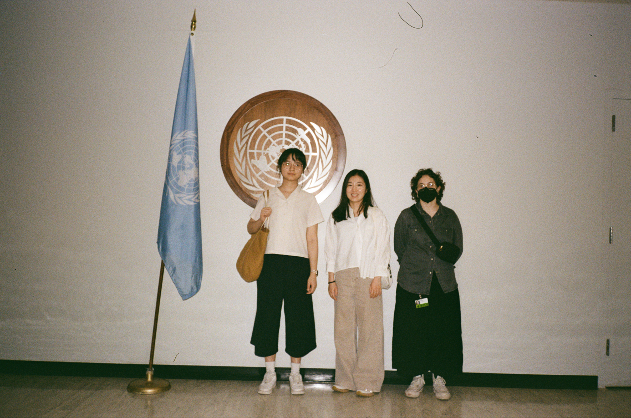
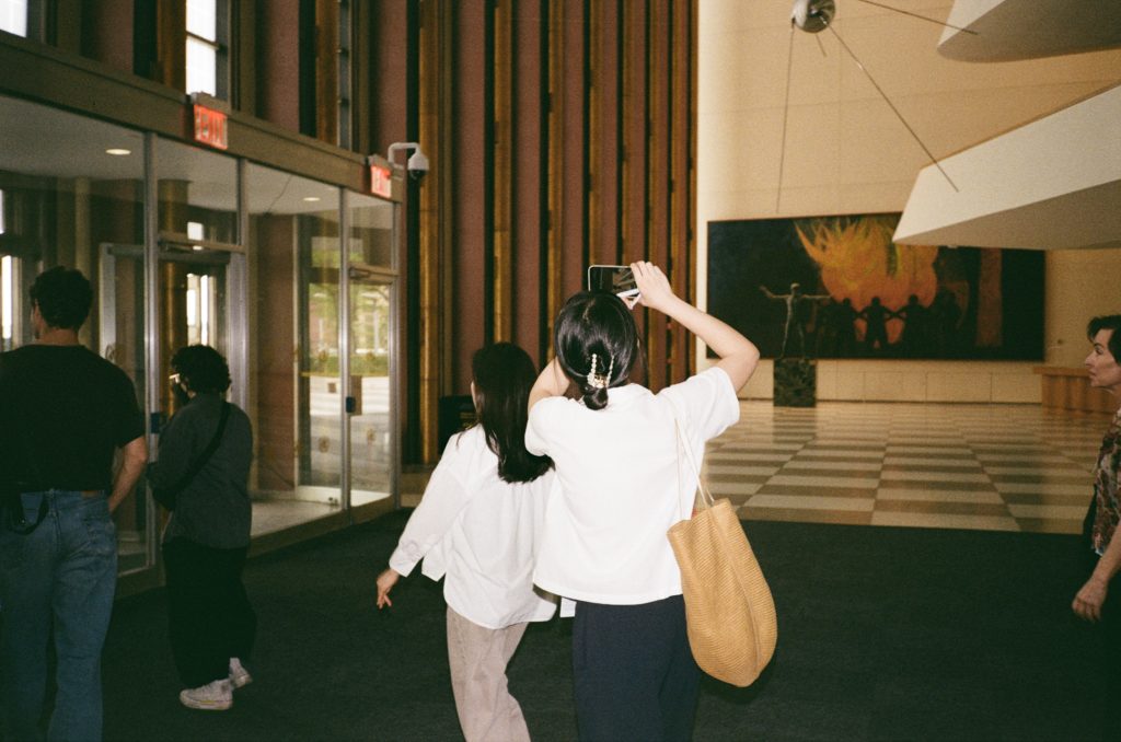
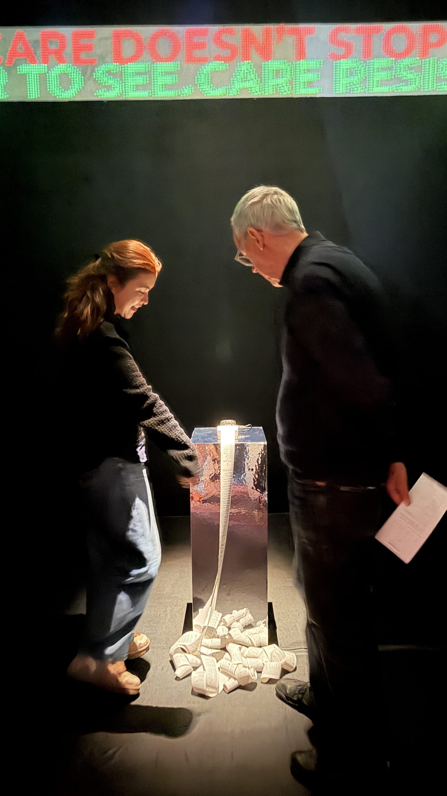
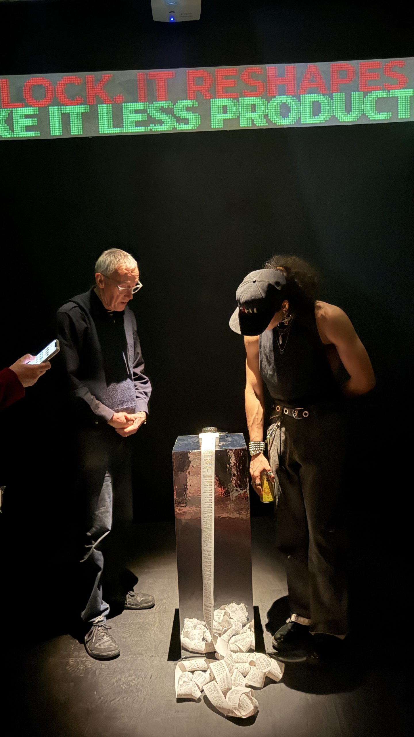
On April 16, 2026 the MFA Design first year cohort, Qing Zeng, Jung A Huh, and Ali El-Chaer, conducted field research across two distinct institutional spaces in New York City: the United Nations Headquarters and the New Museum. The objective was to investigate the intersection of global governance, architectural systems, and contemporary curation, resulting in a game that maps interactions onto the digital interface.
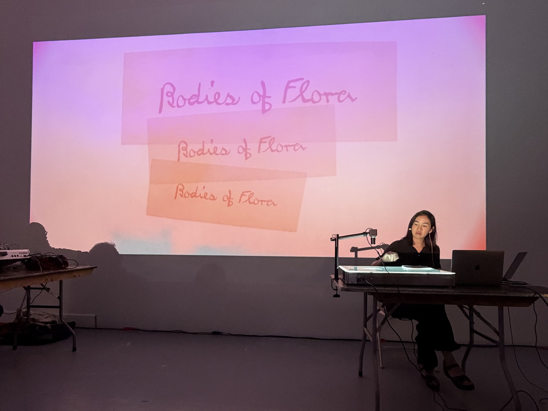
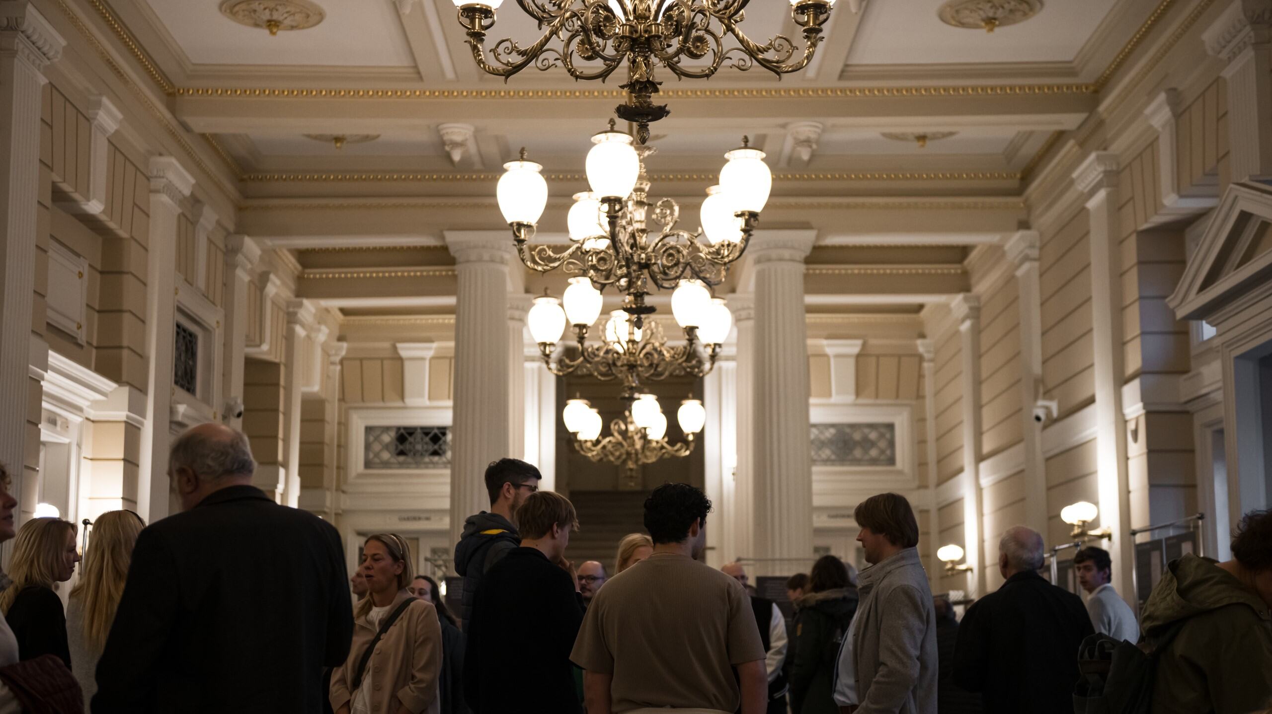
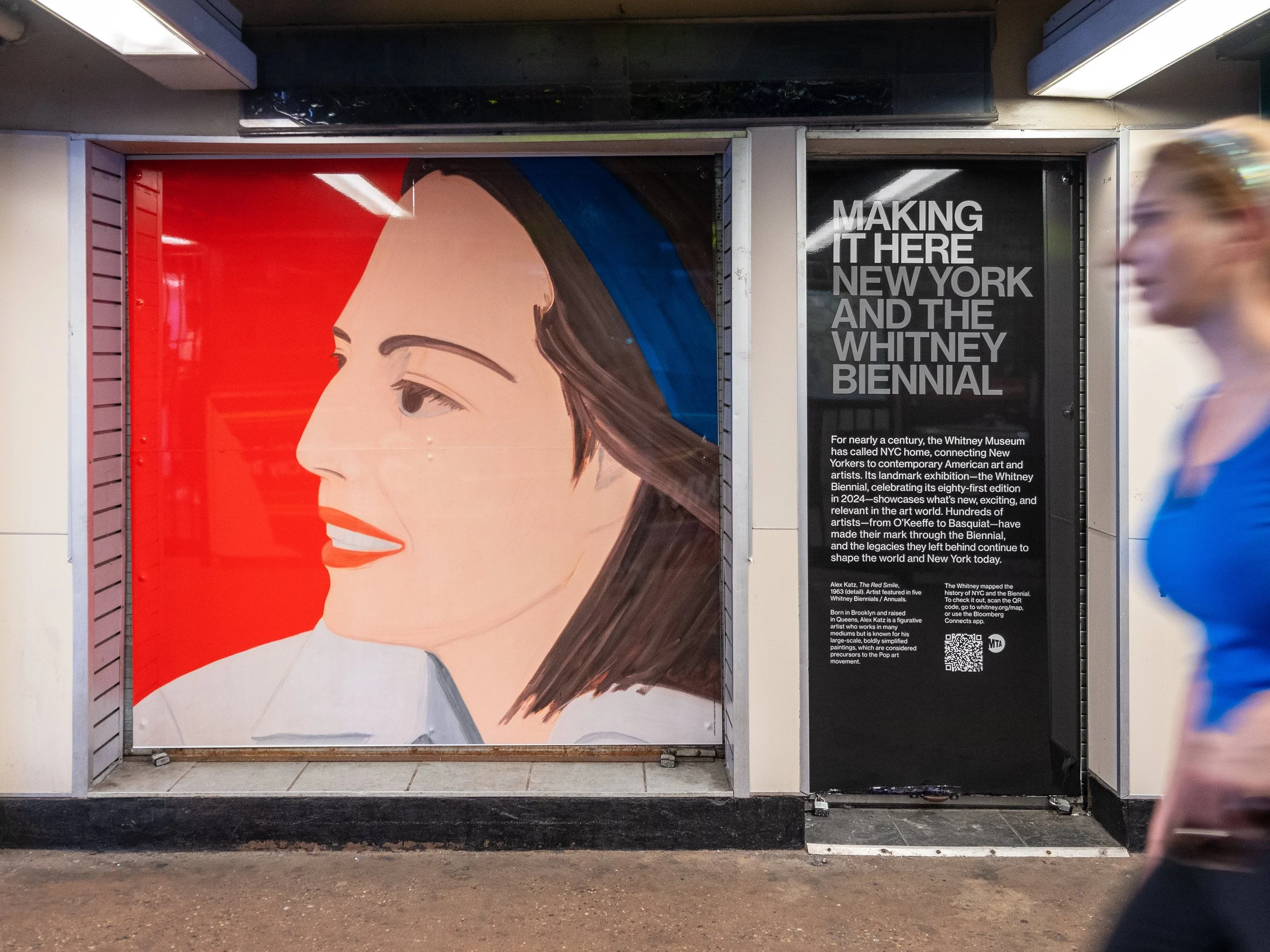
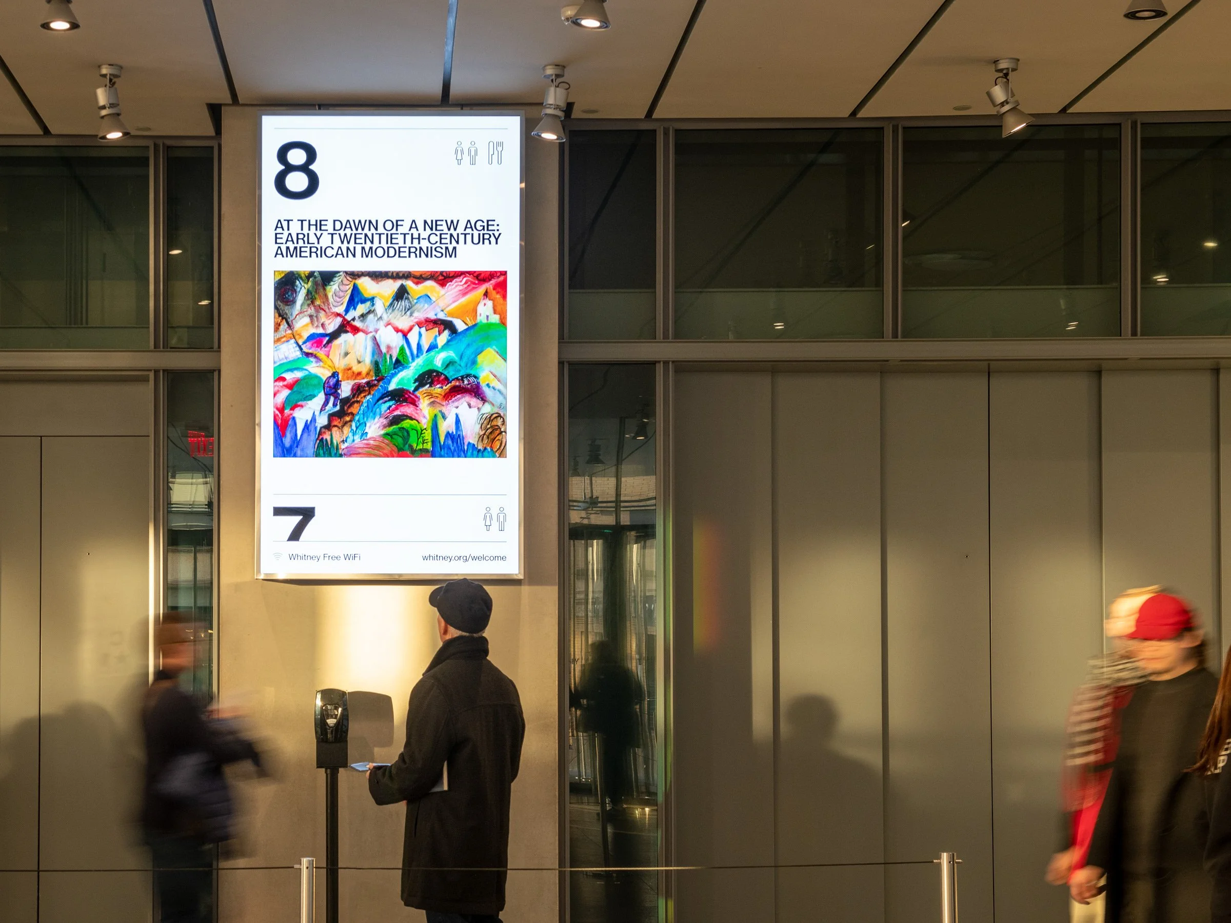
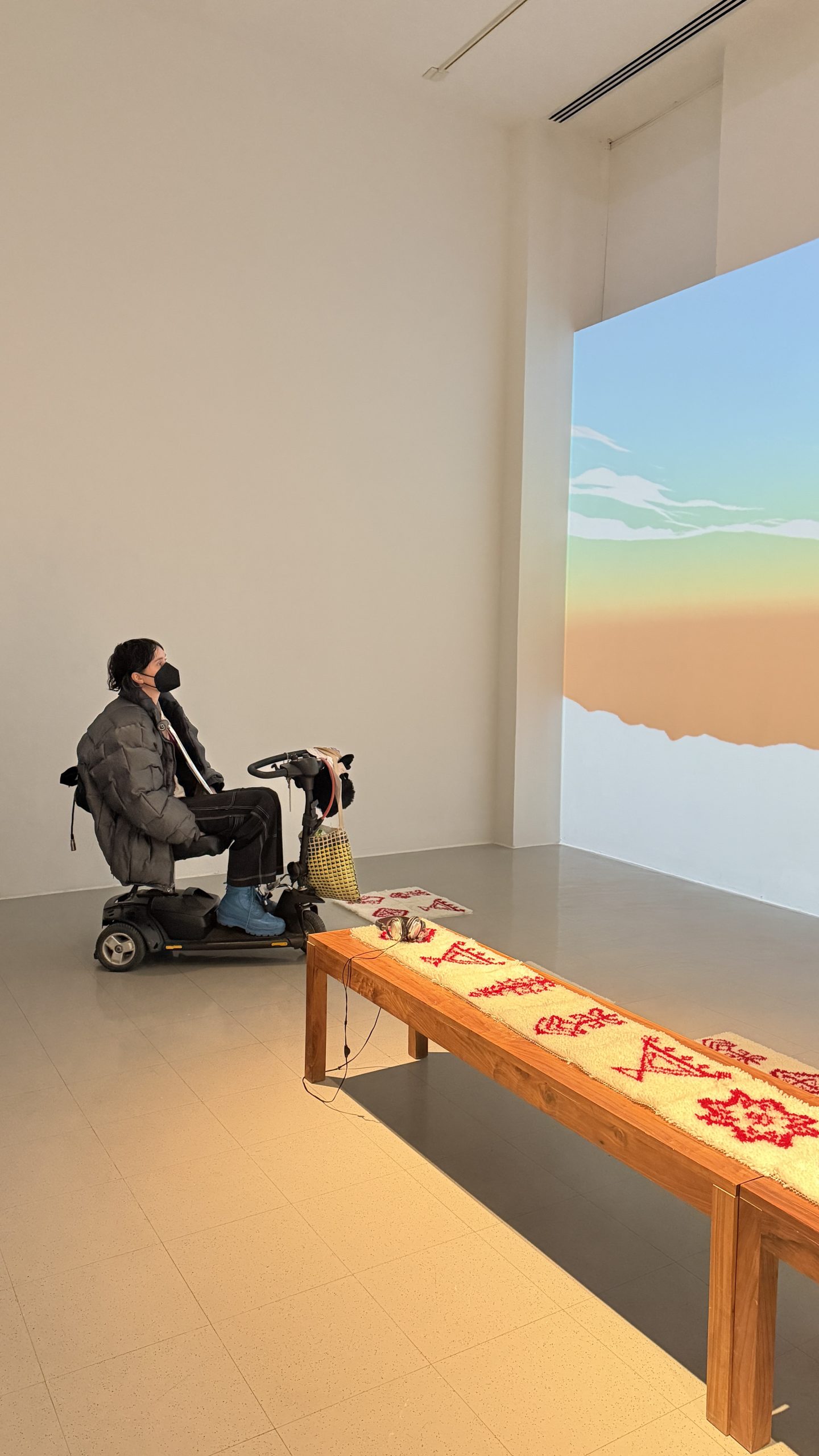
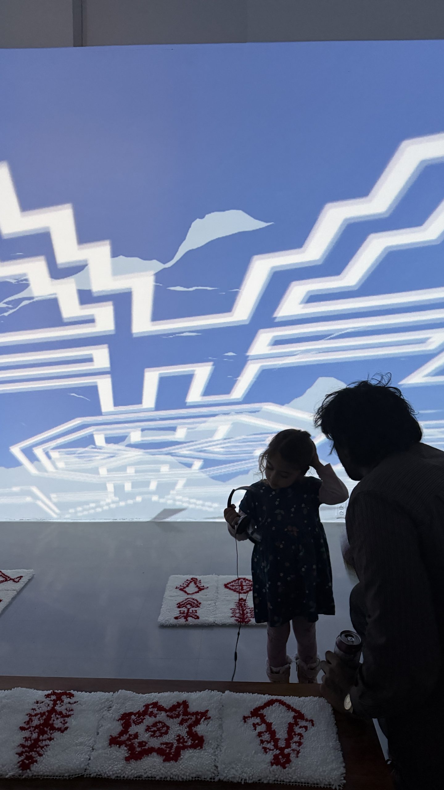
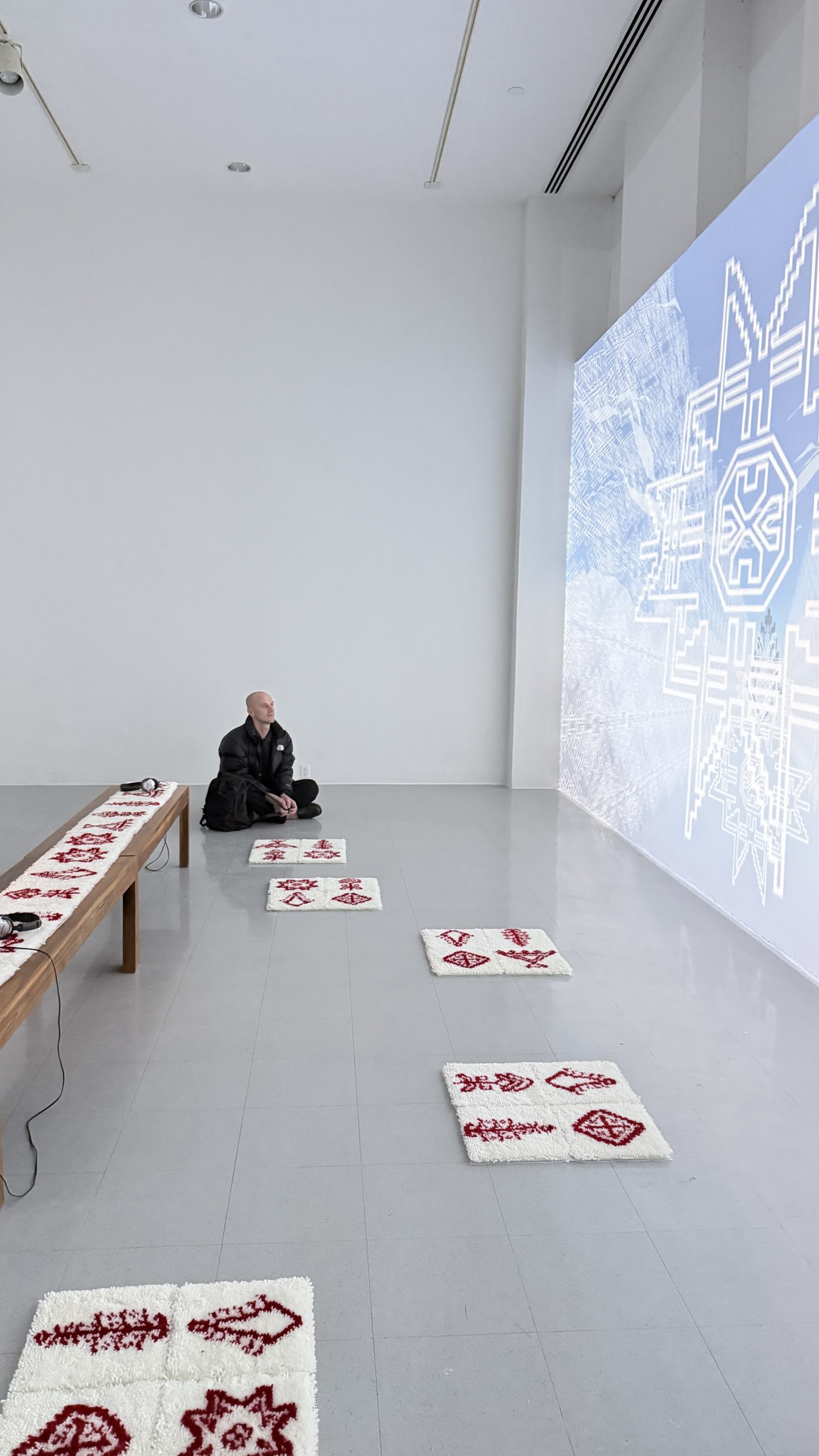
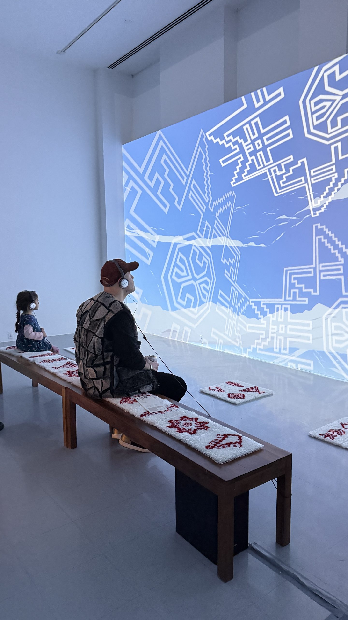
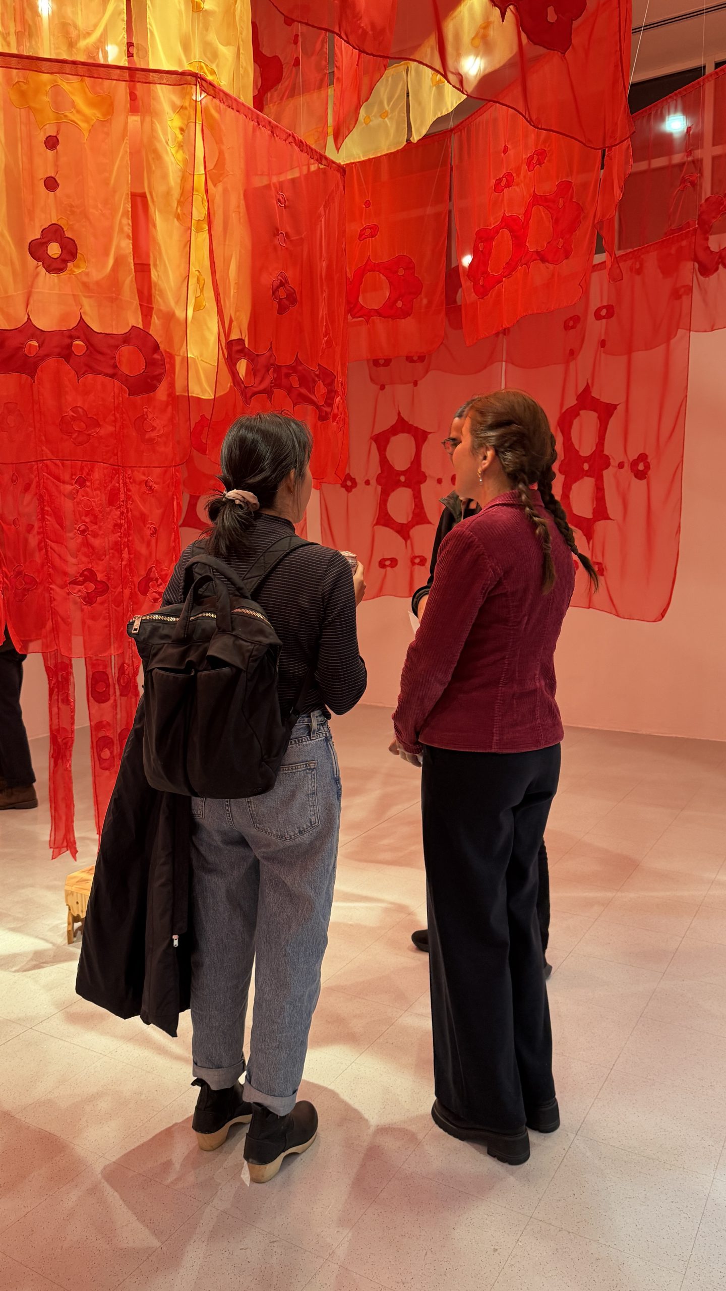
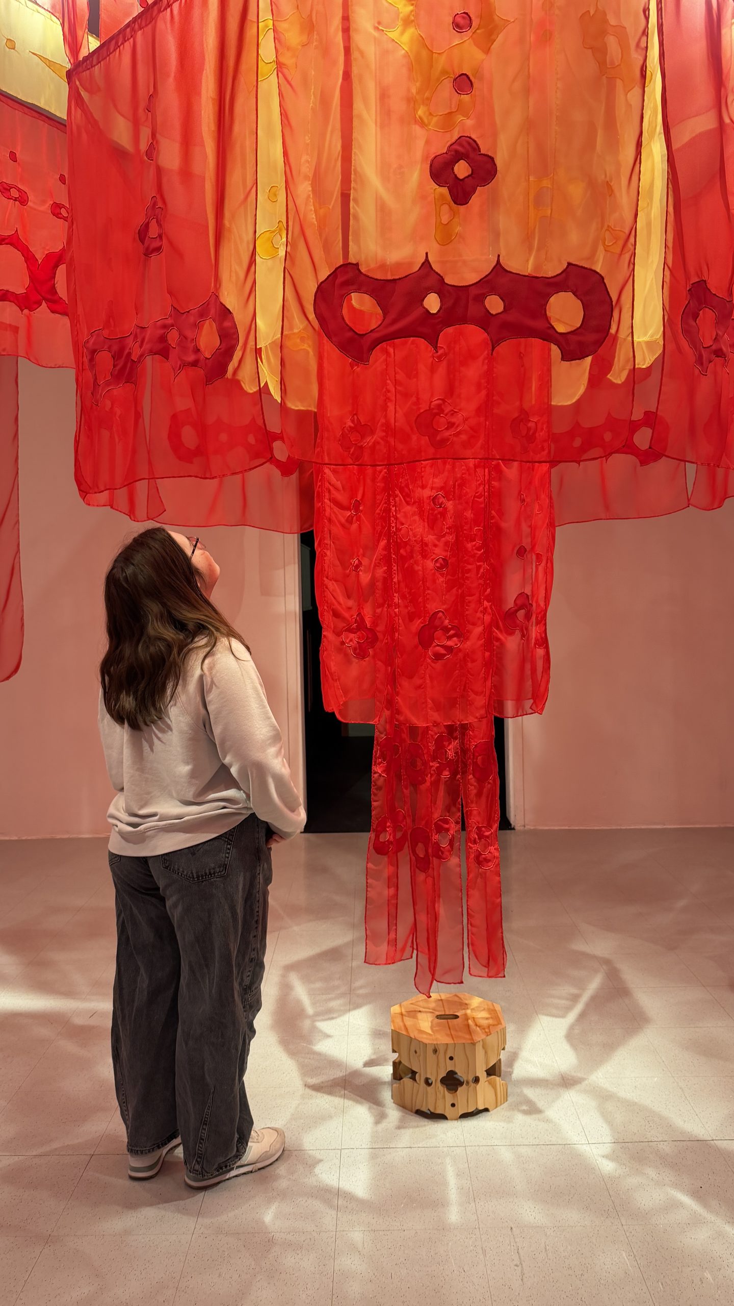
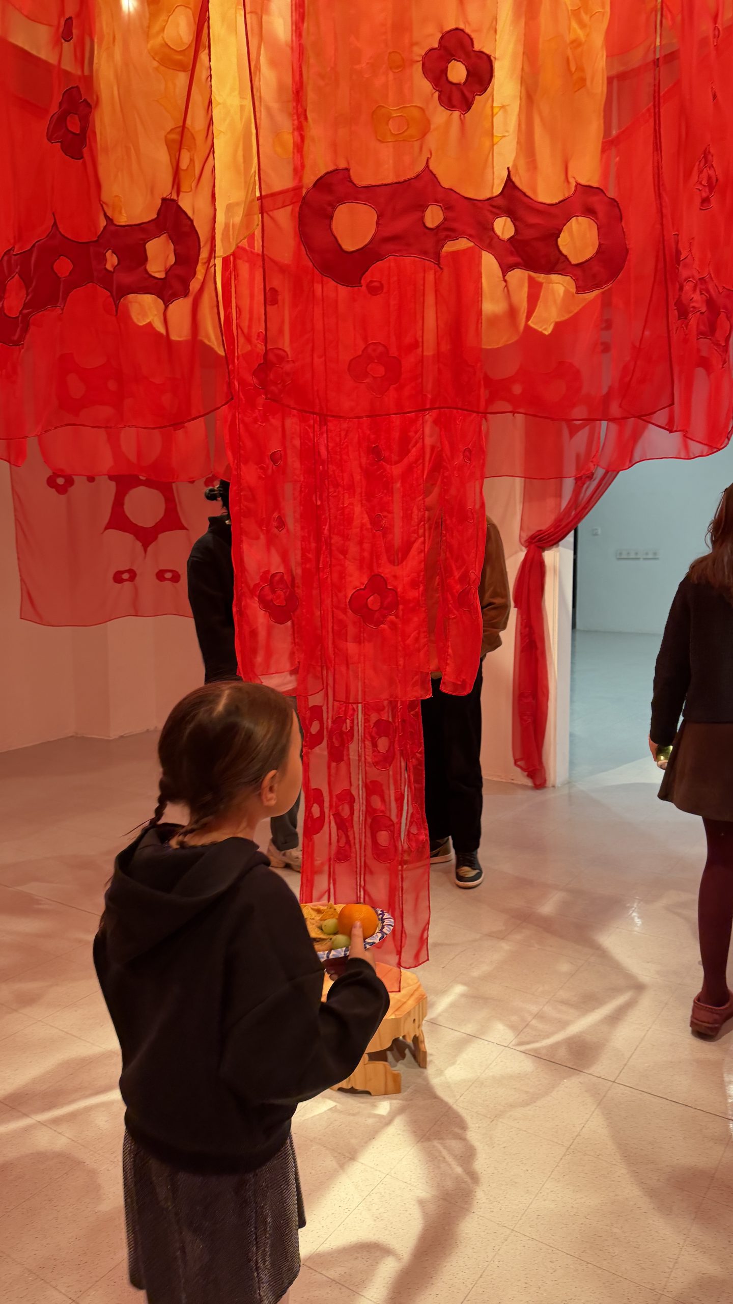
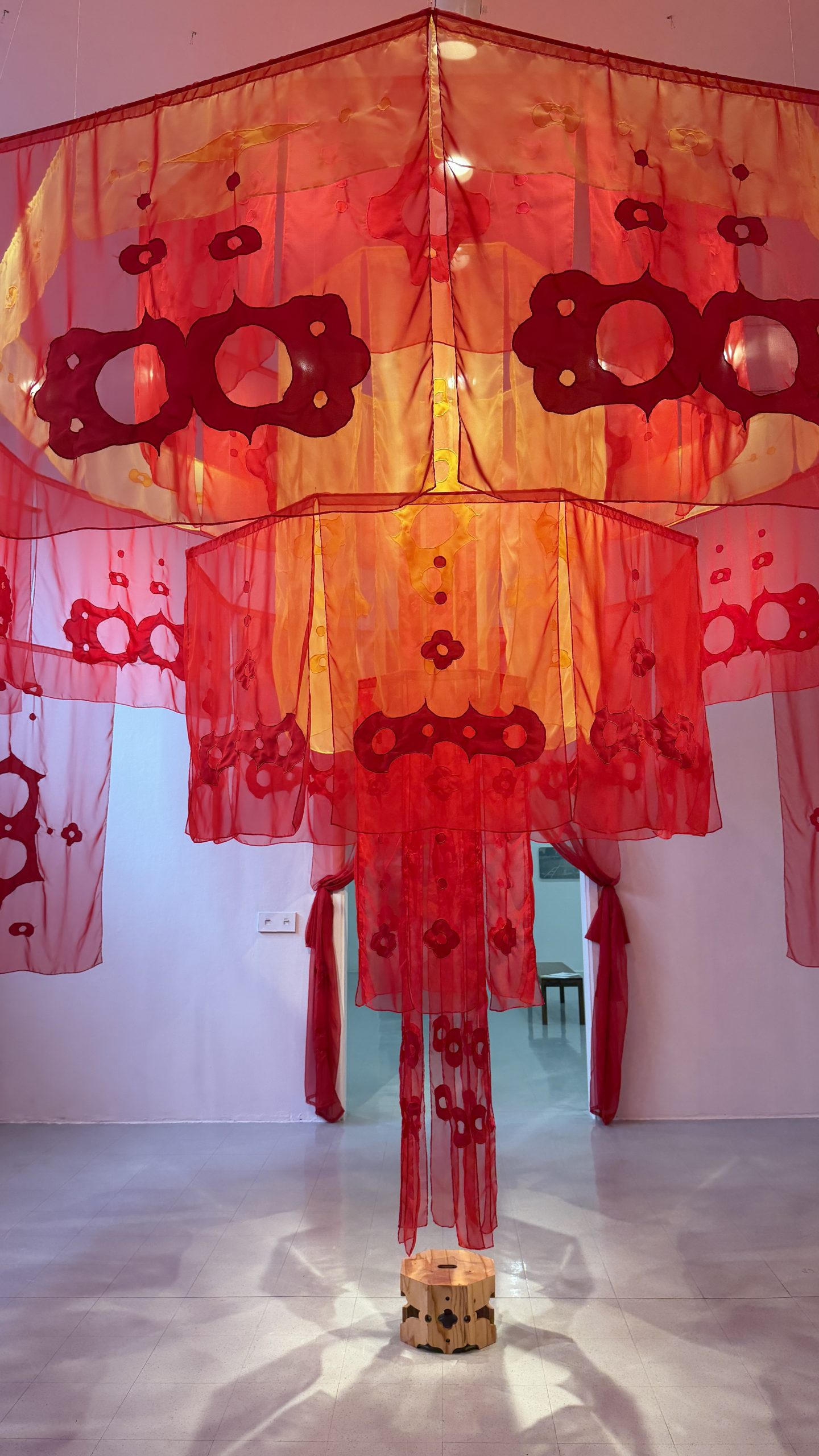
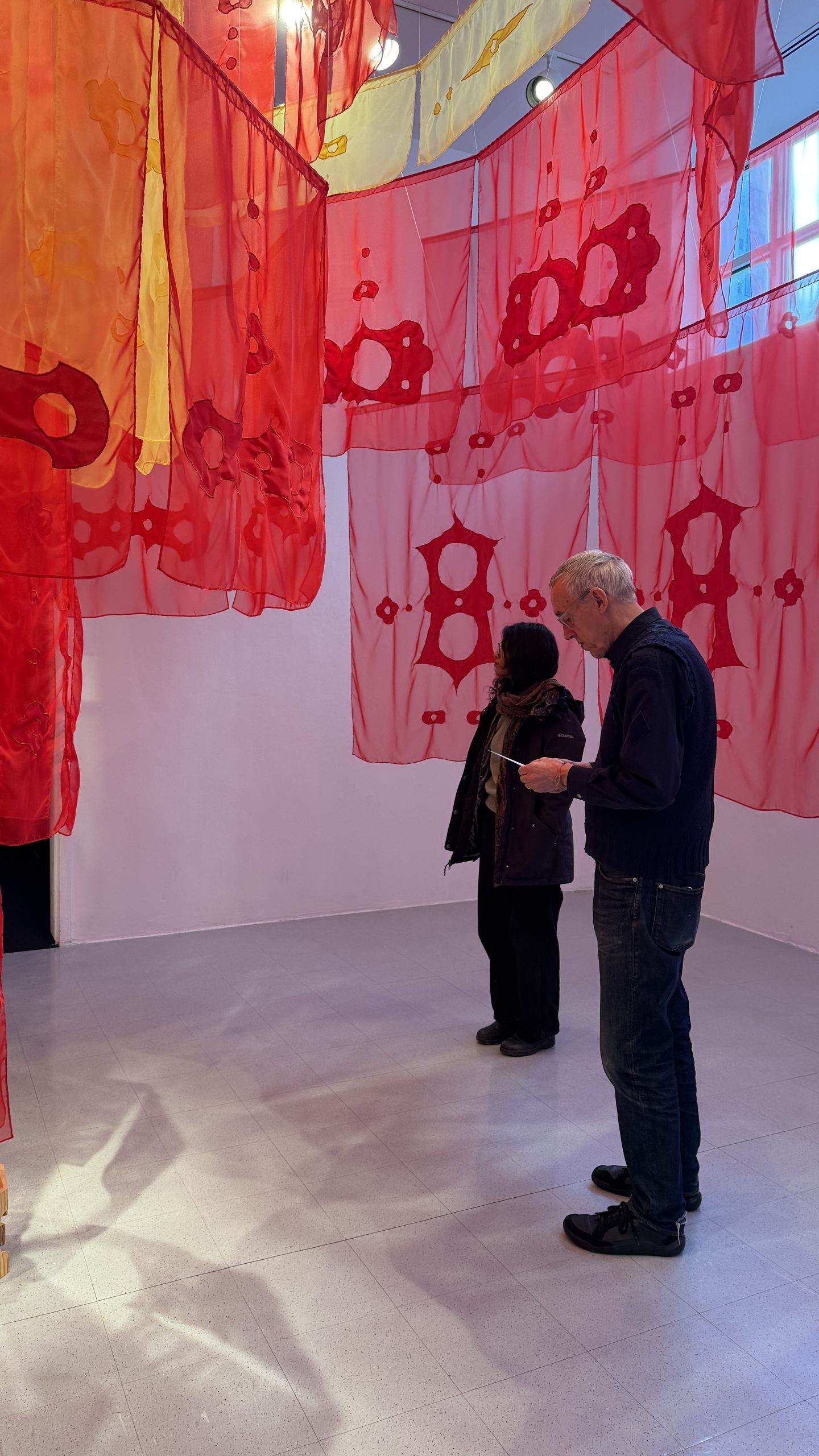
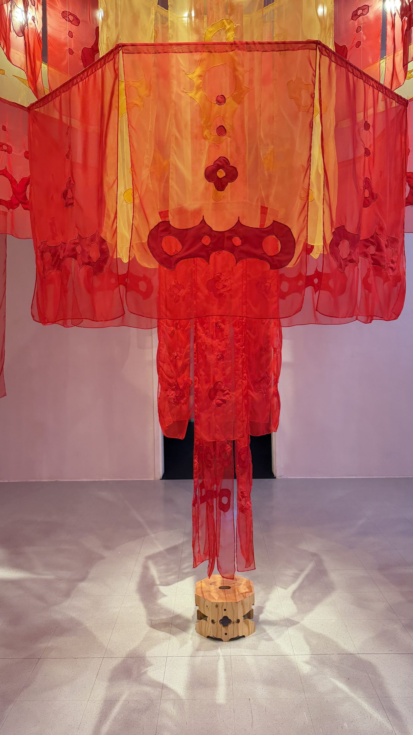
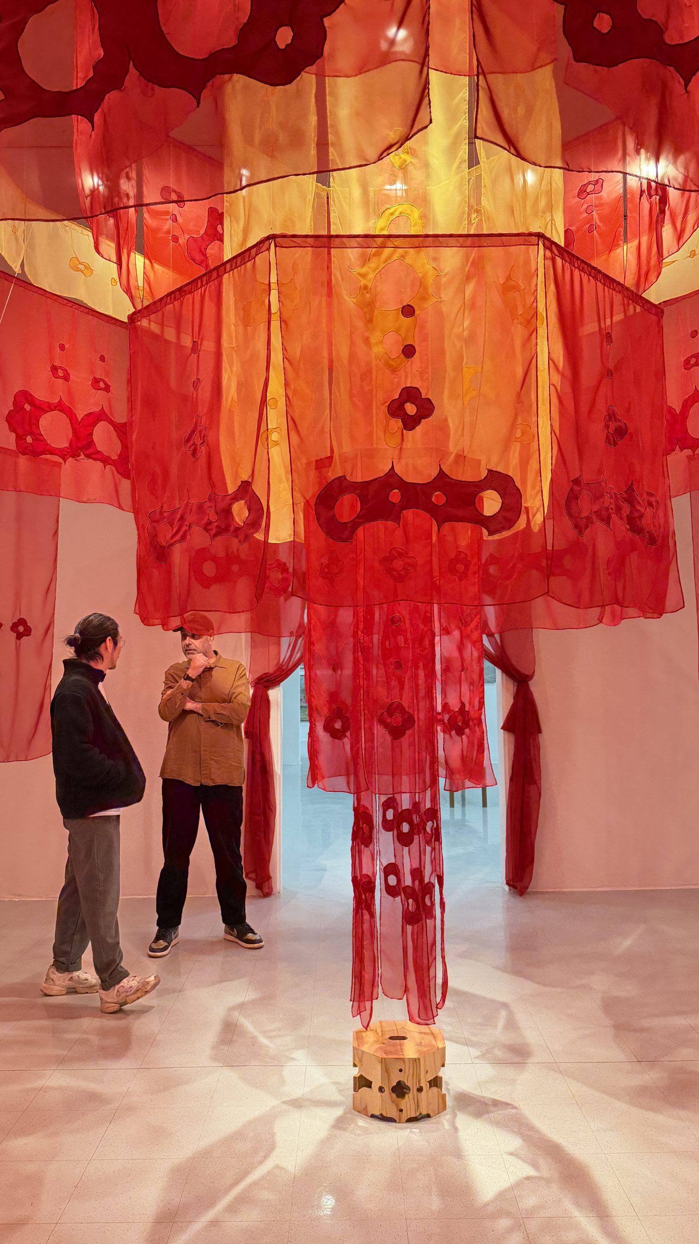
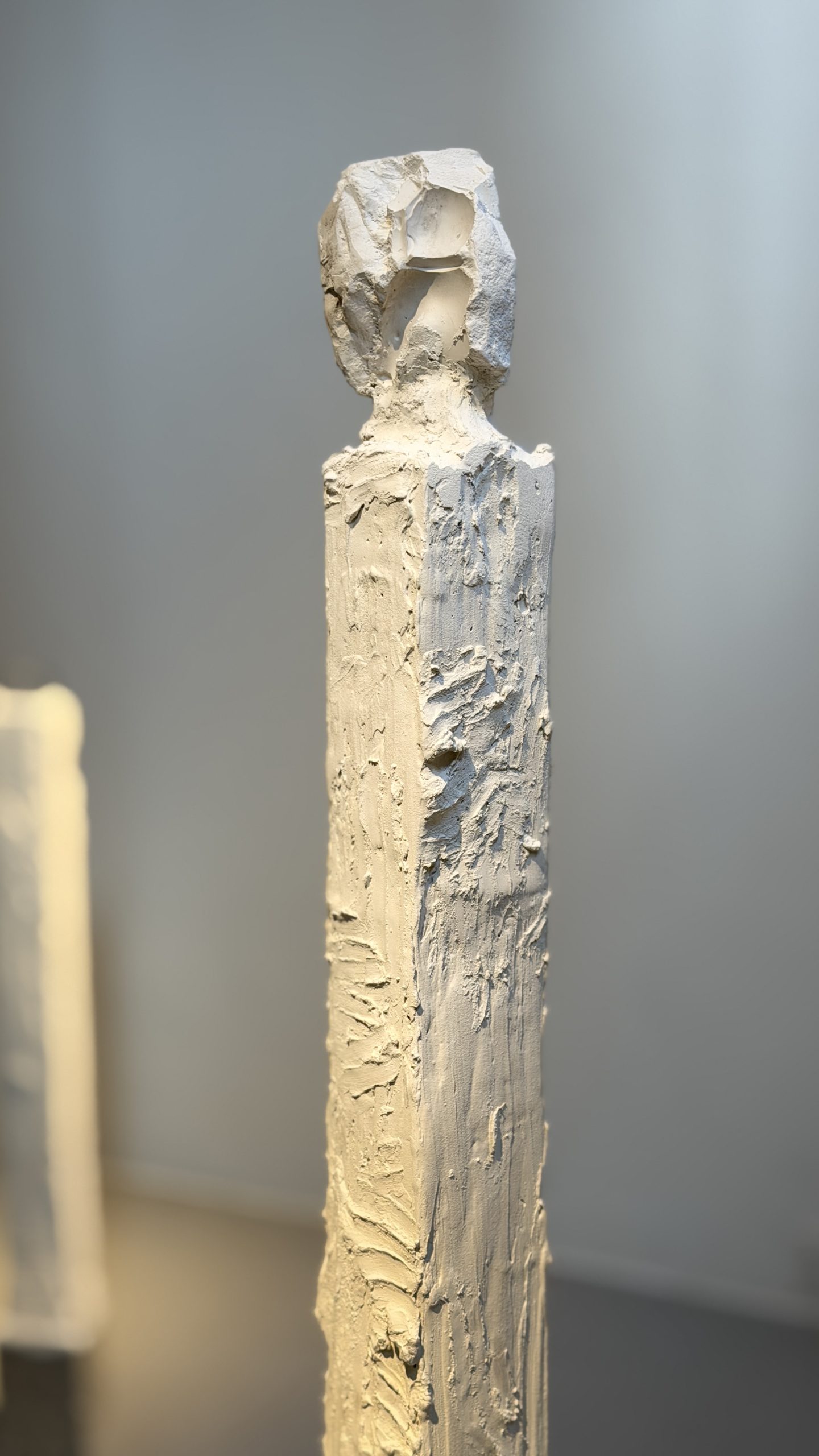
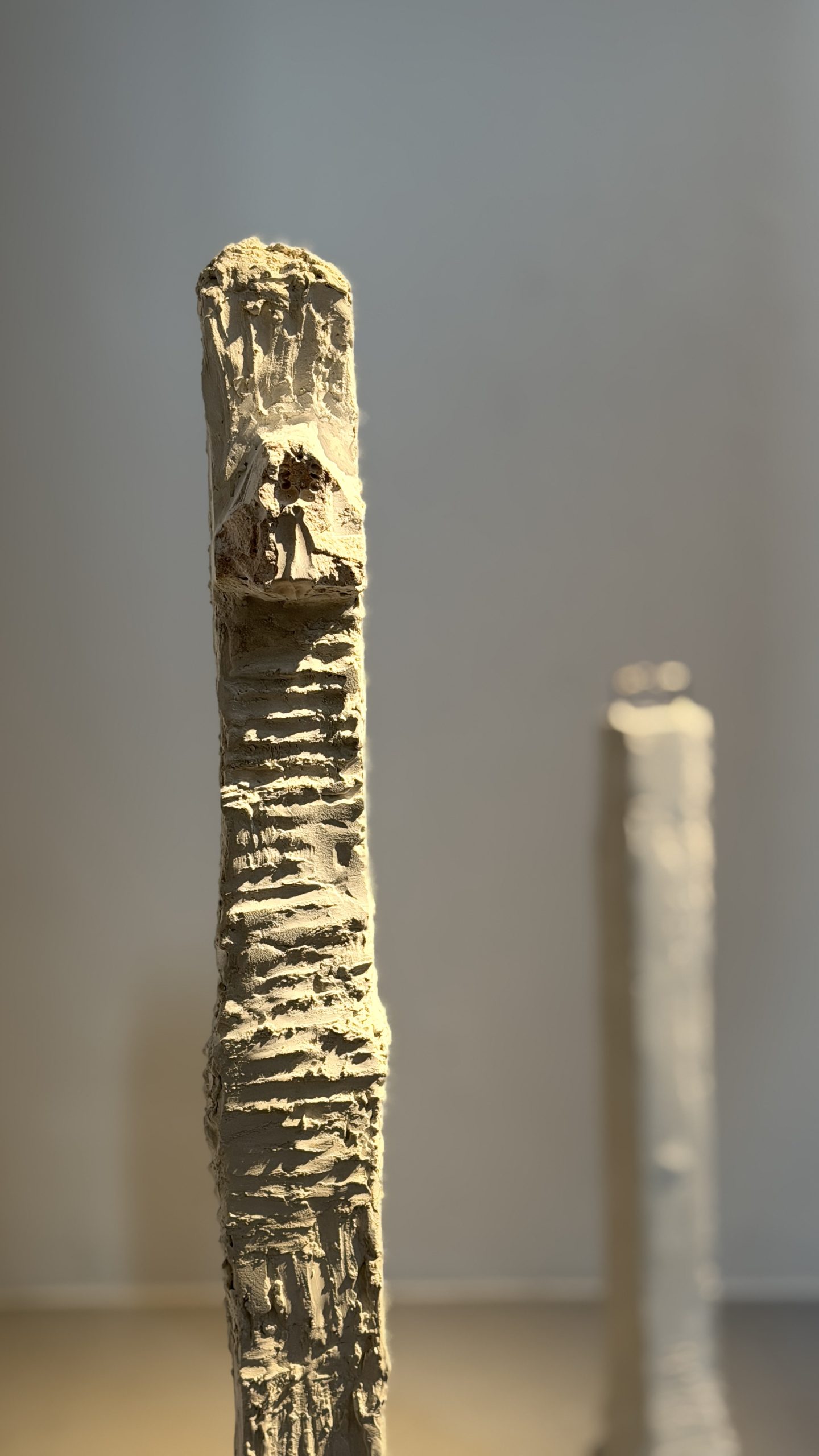
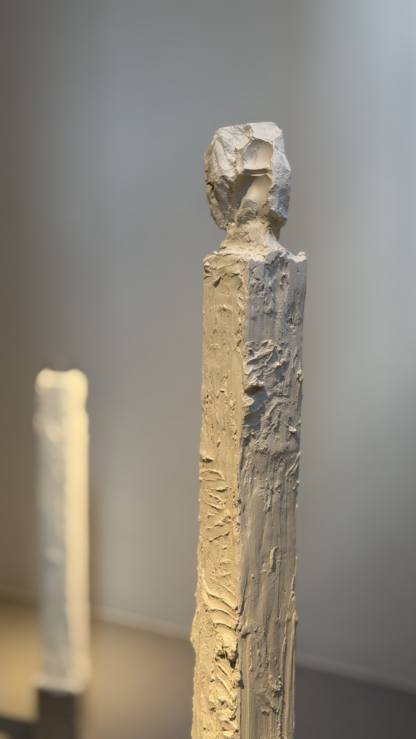
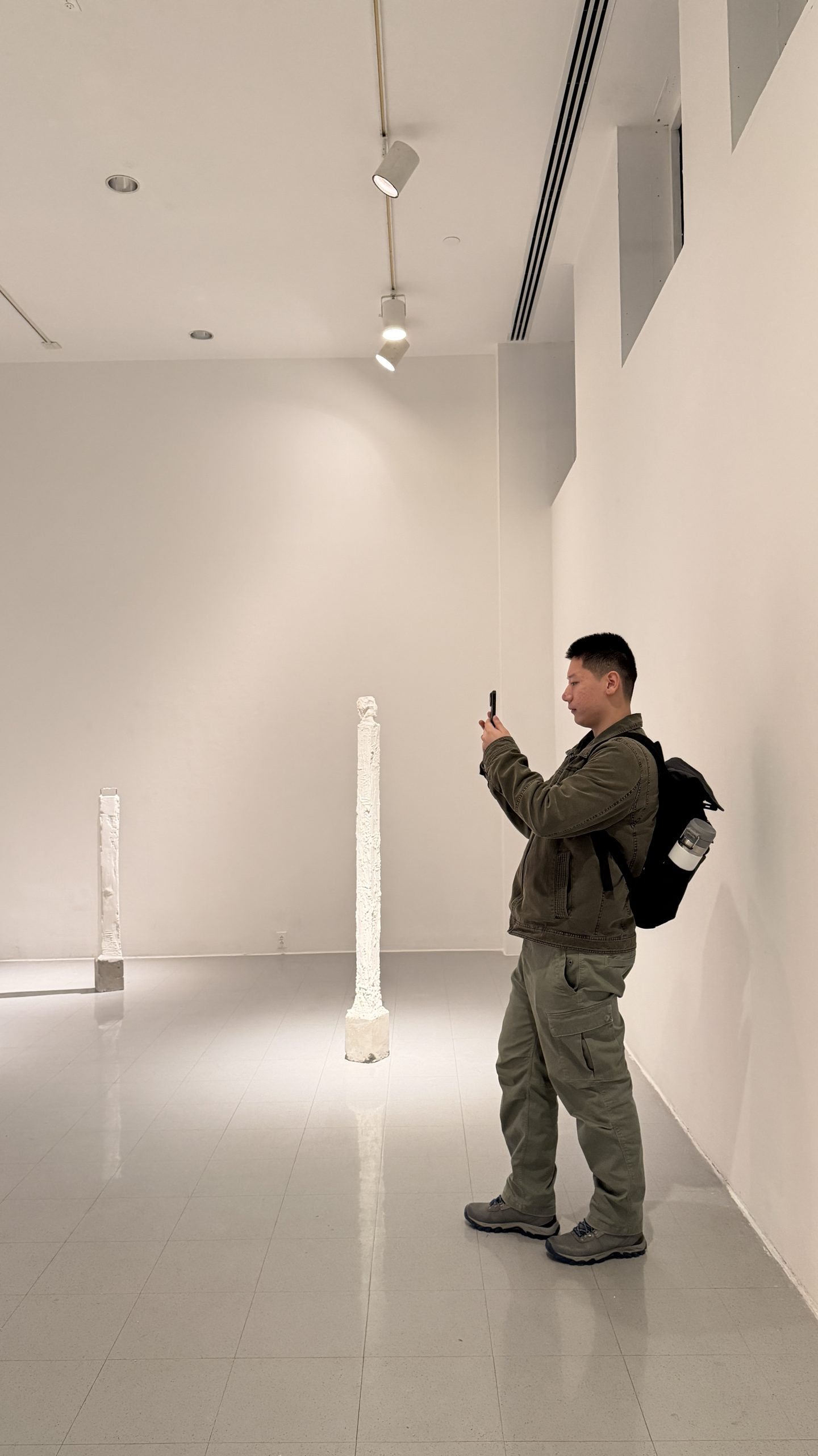
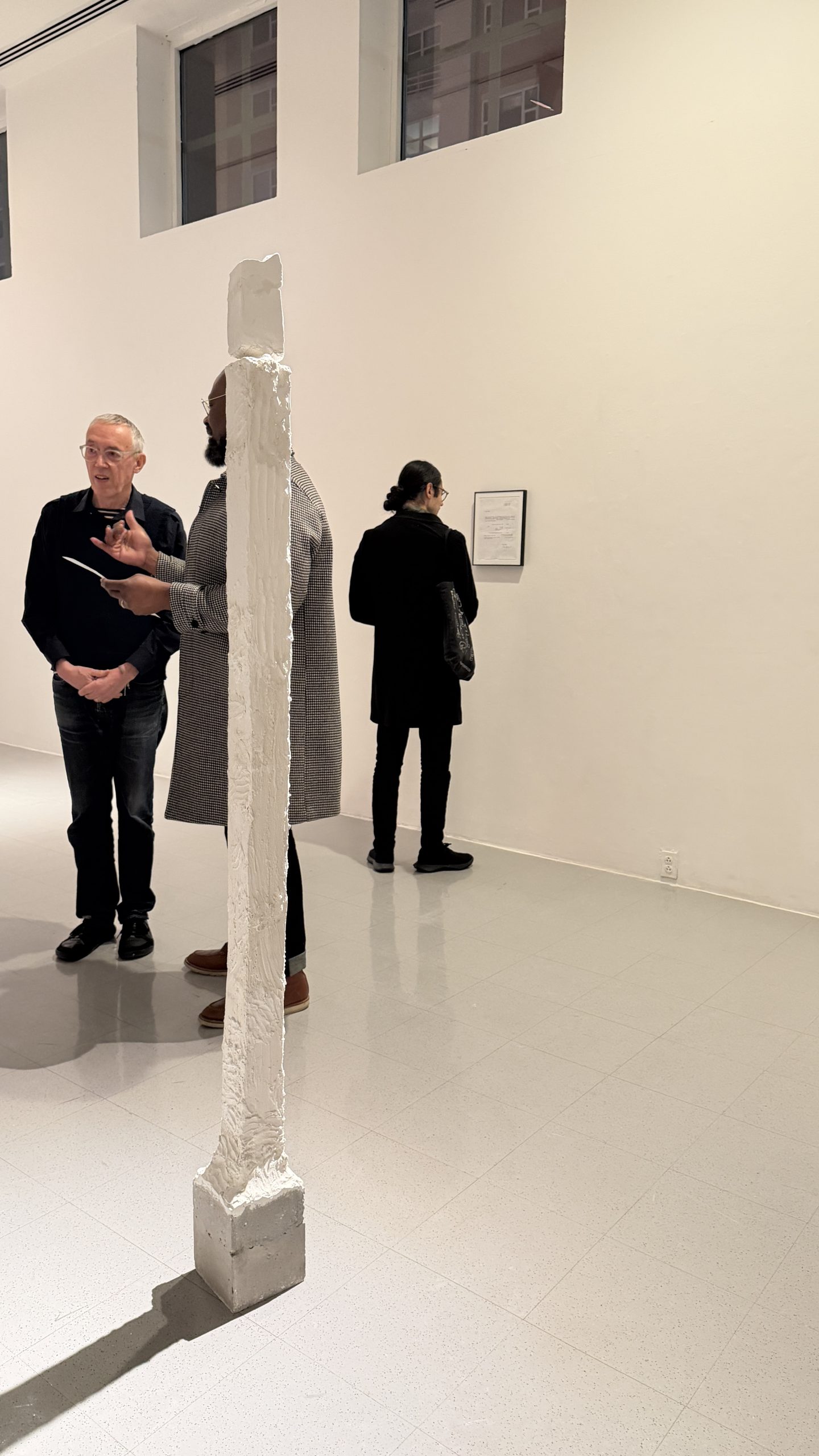
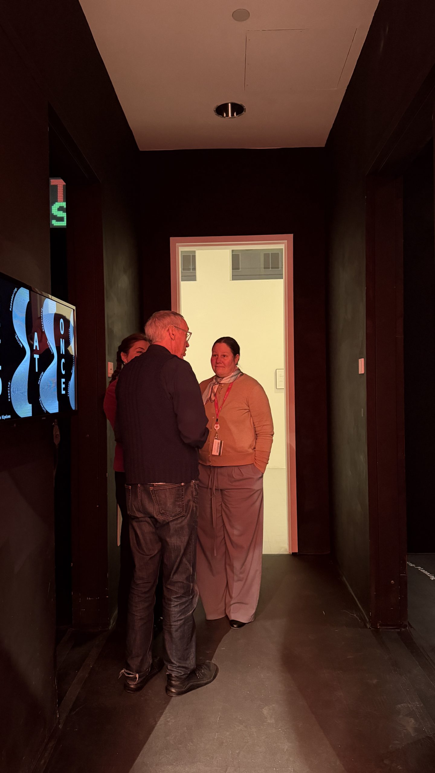
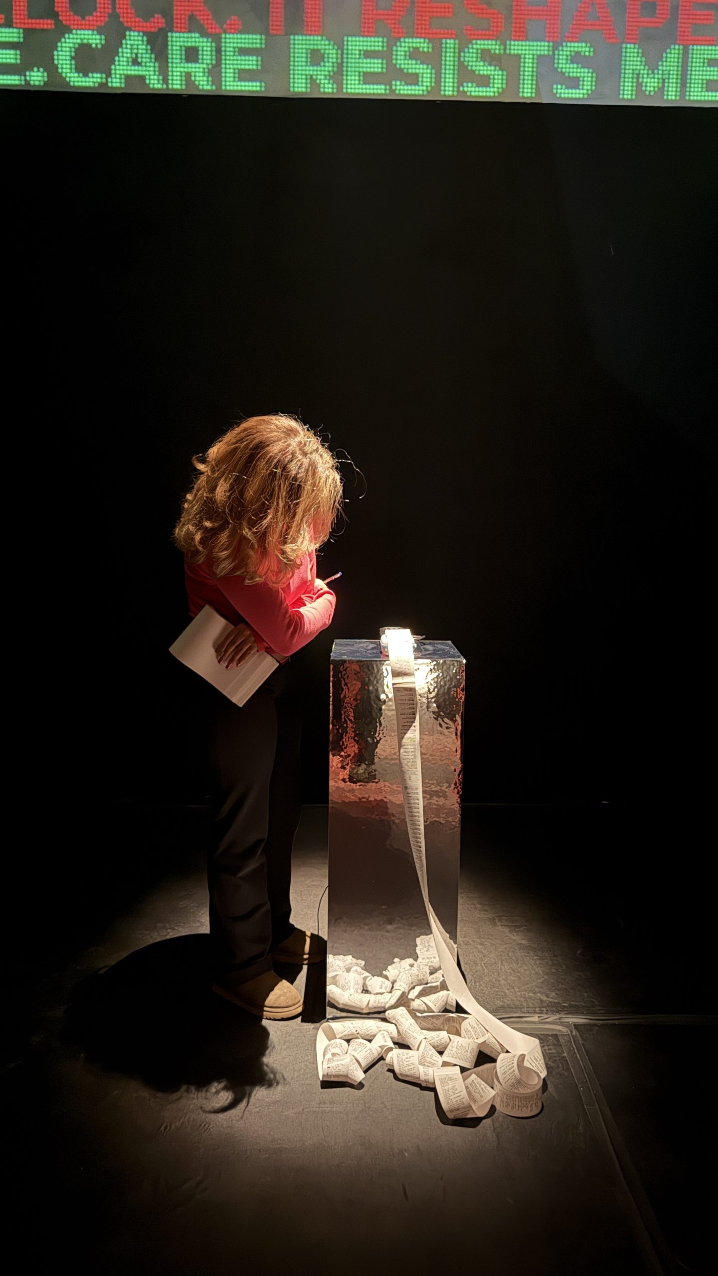
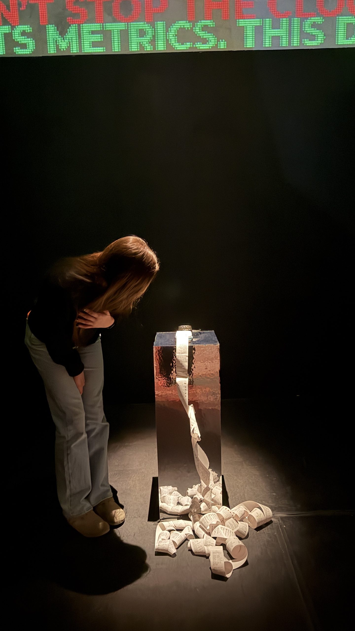
The morning began at the United Nations Headquarters, delving into the operational architecture of the UN: This track examined the institutional mechanisms and systemic frameworks of the UN, focusing on how global diplomacy is structured, executed, and maintained across international boundaries. The second tour spoke on the physical architecture: This track explained the design of the headquarters, investigating how the physical forms, materials, and spatial layouts reflect or challenge the UN’s foundational mandates of transparency, unity, and international cooperation. In the afternoon, the class visited the New Museum, engaging with current exhibitions, such as New Humans: Memories of the Future, and explored the new extension built to the New Museum.
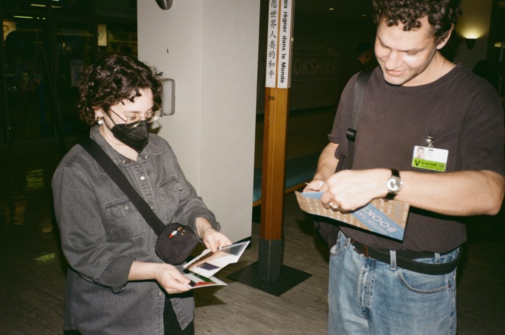
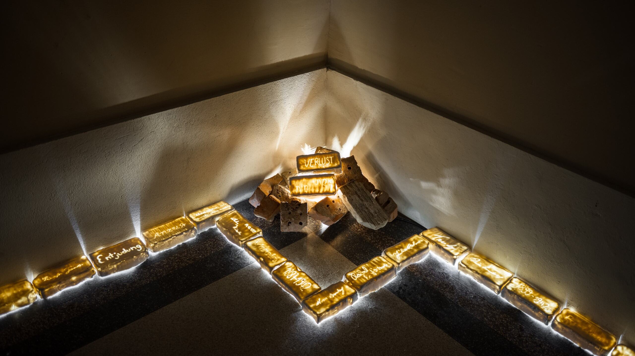
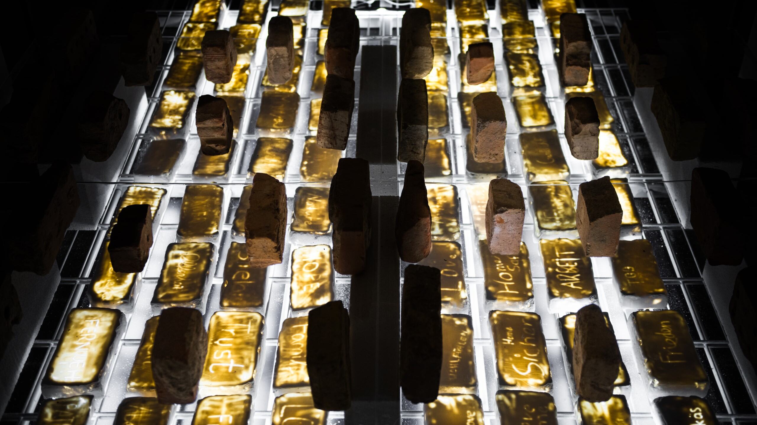
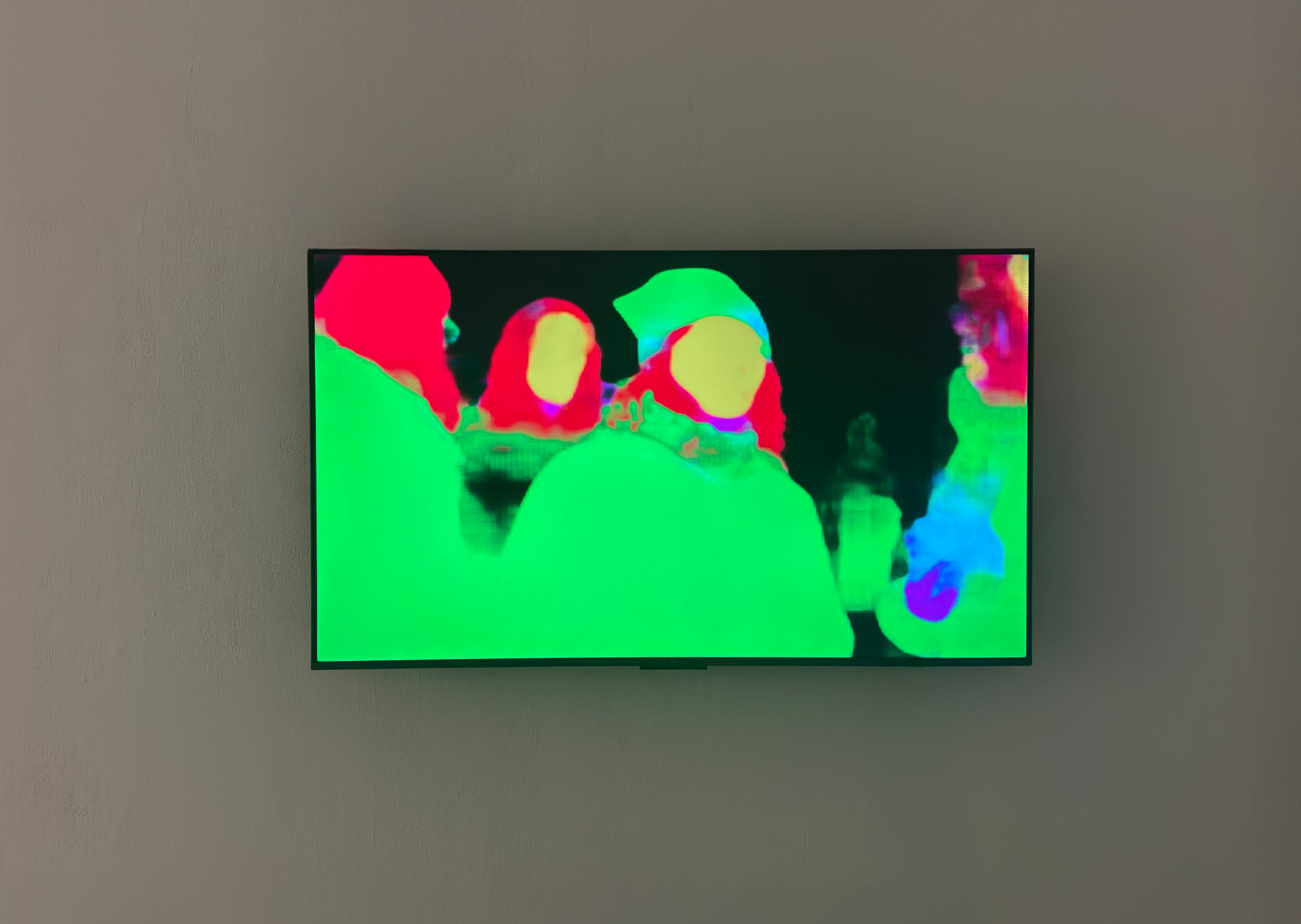
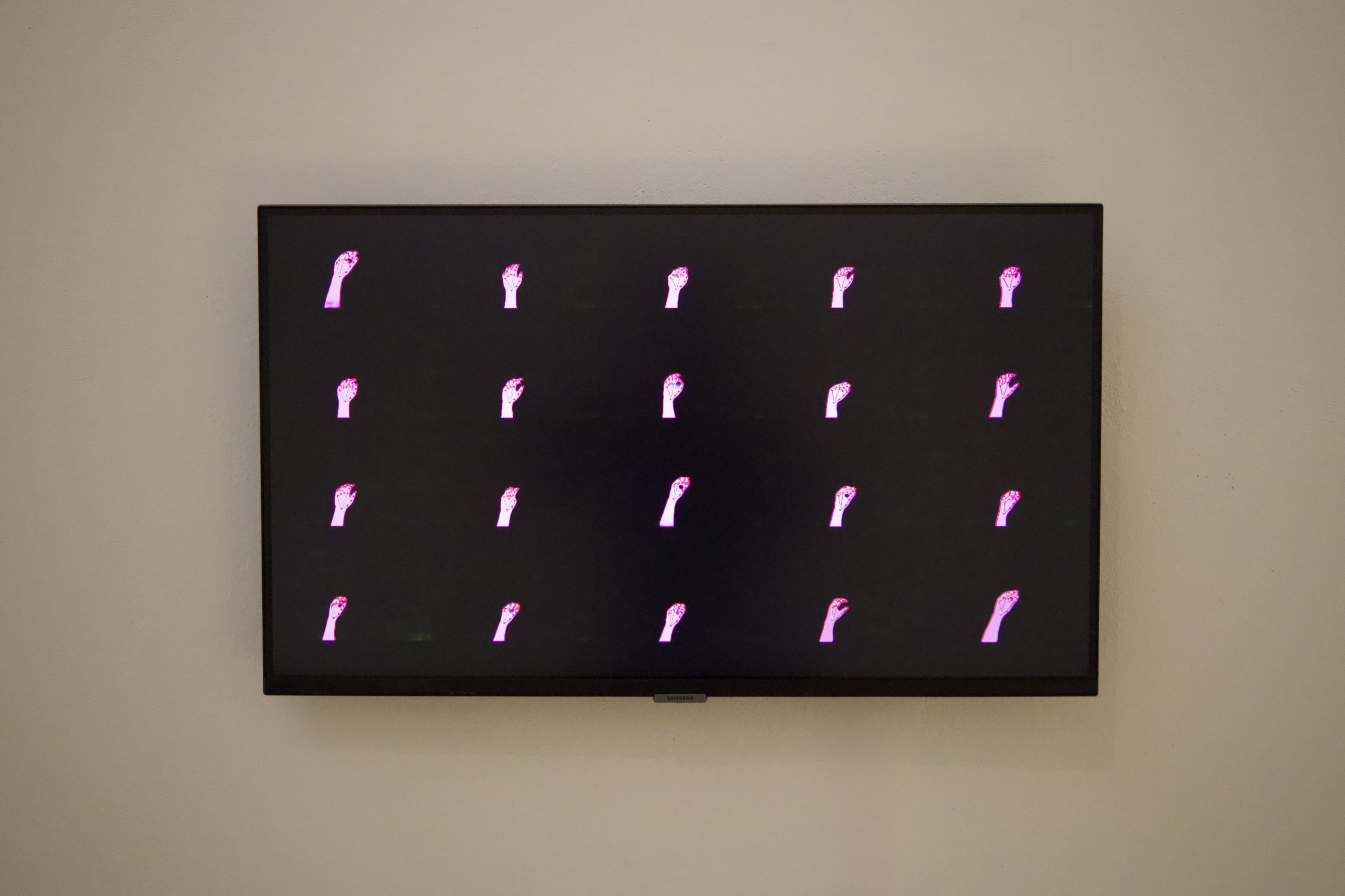
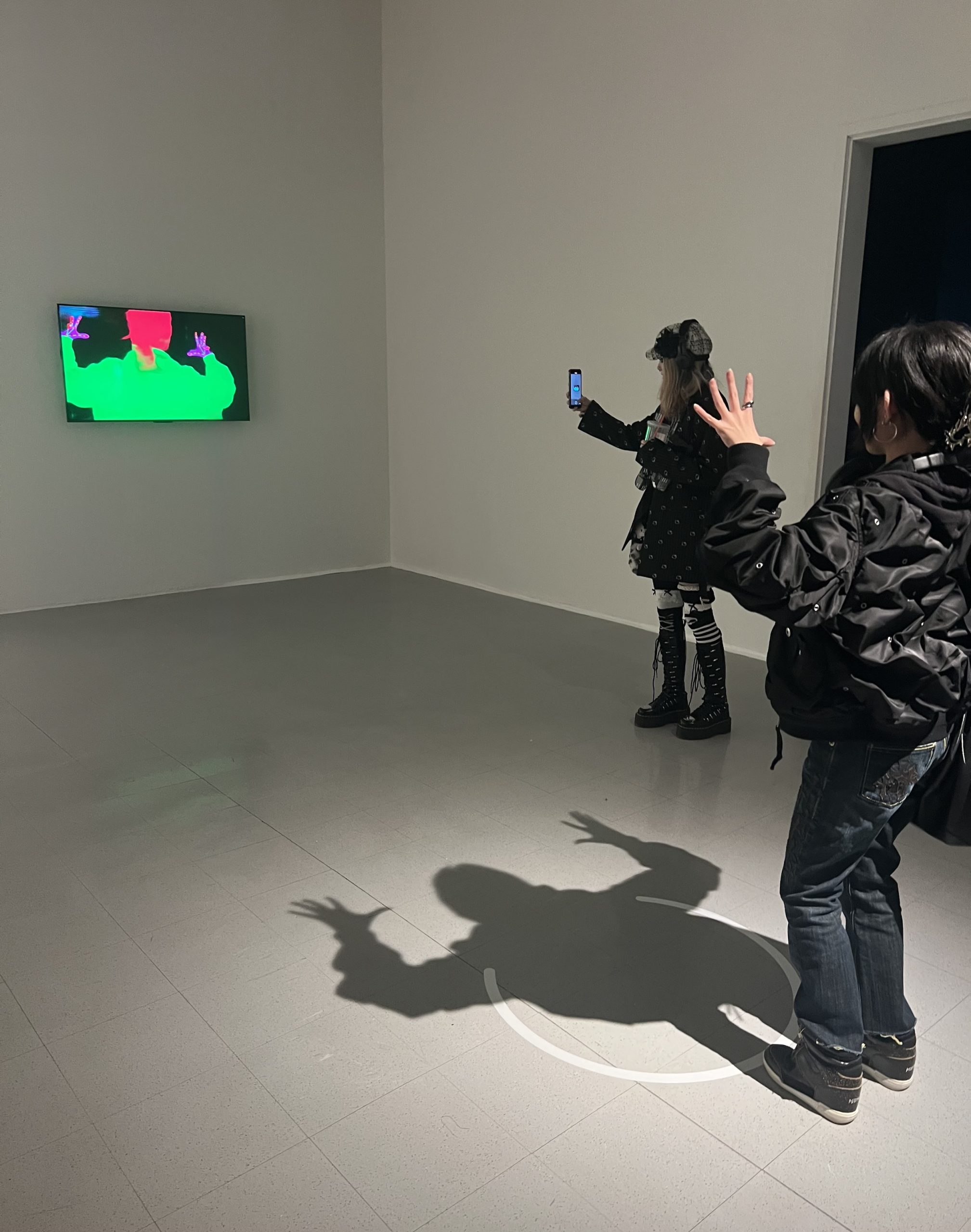
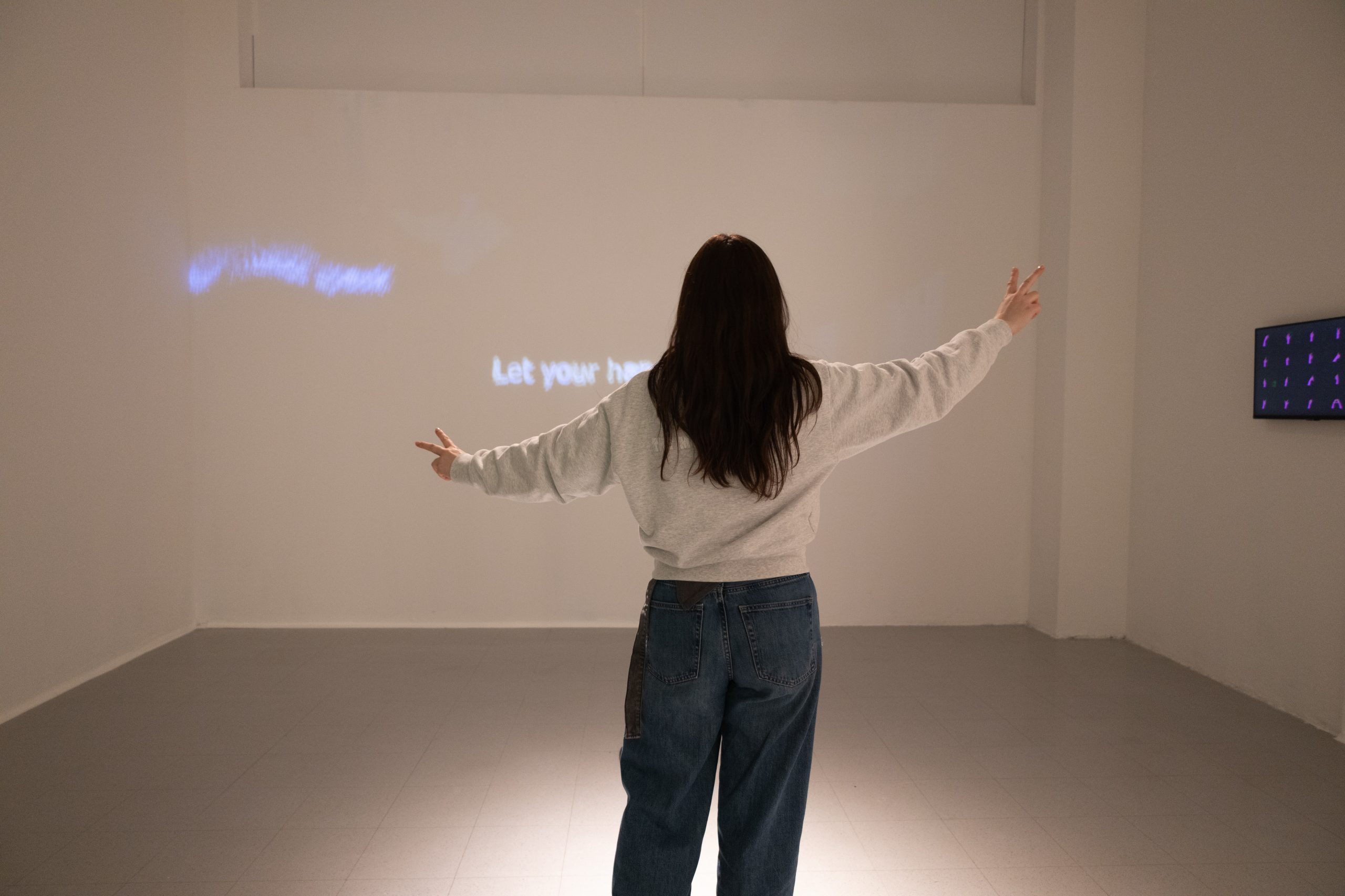
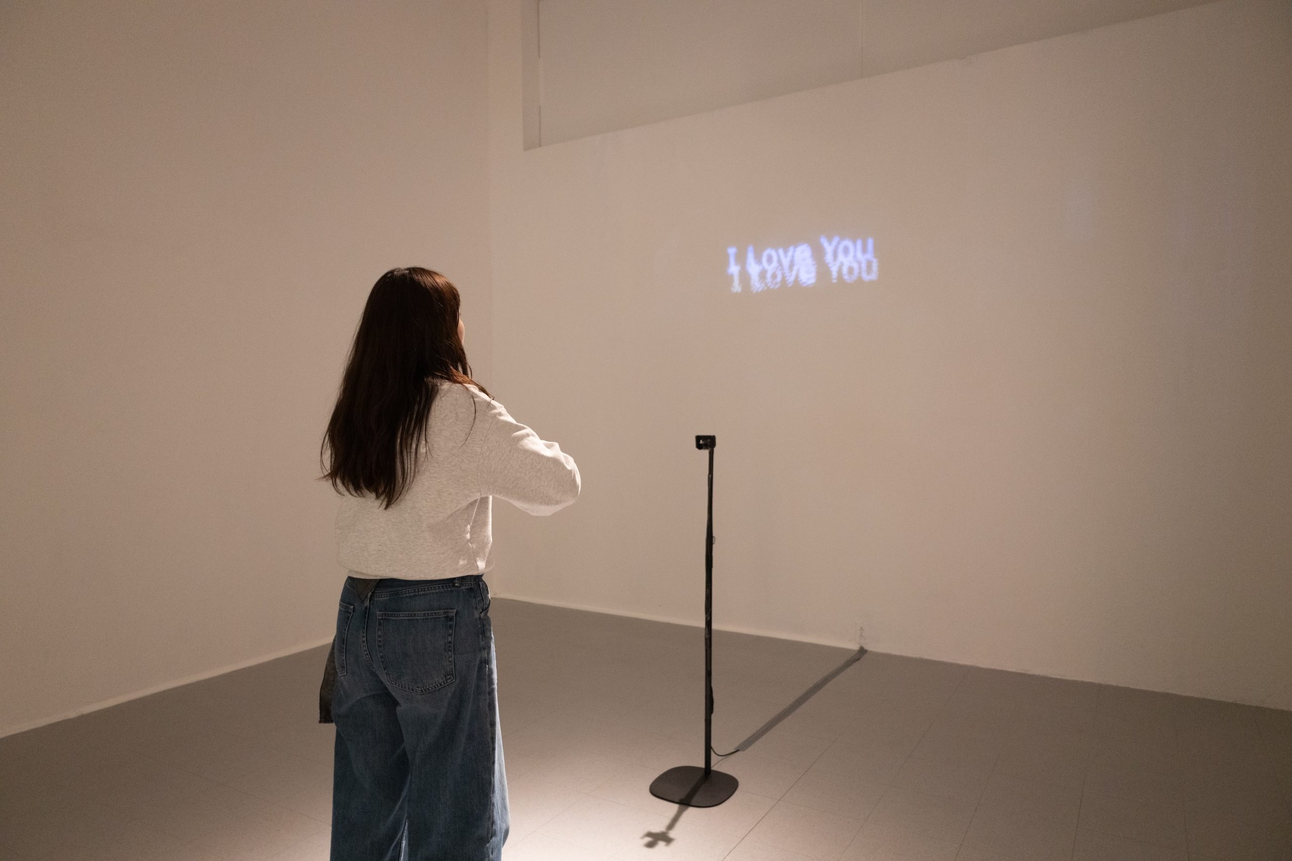
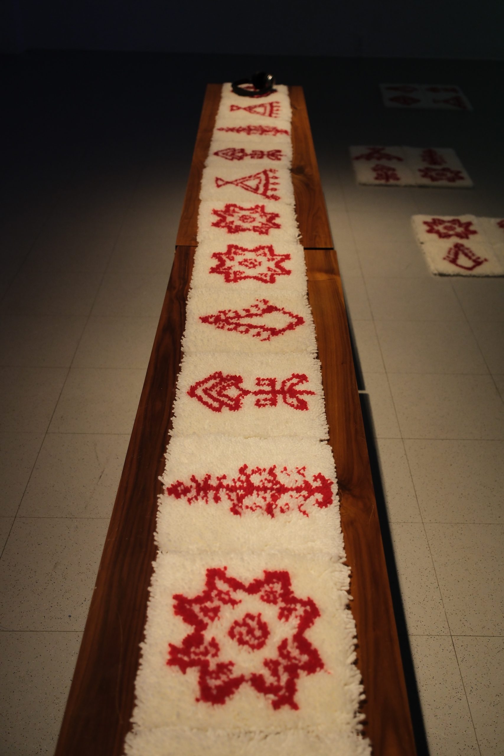
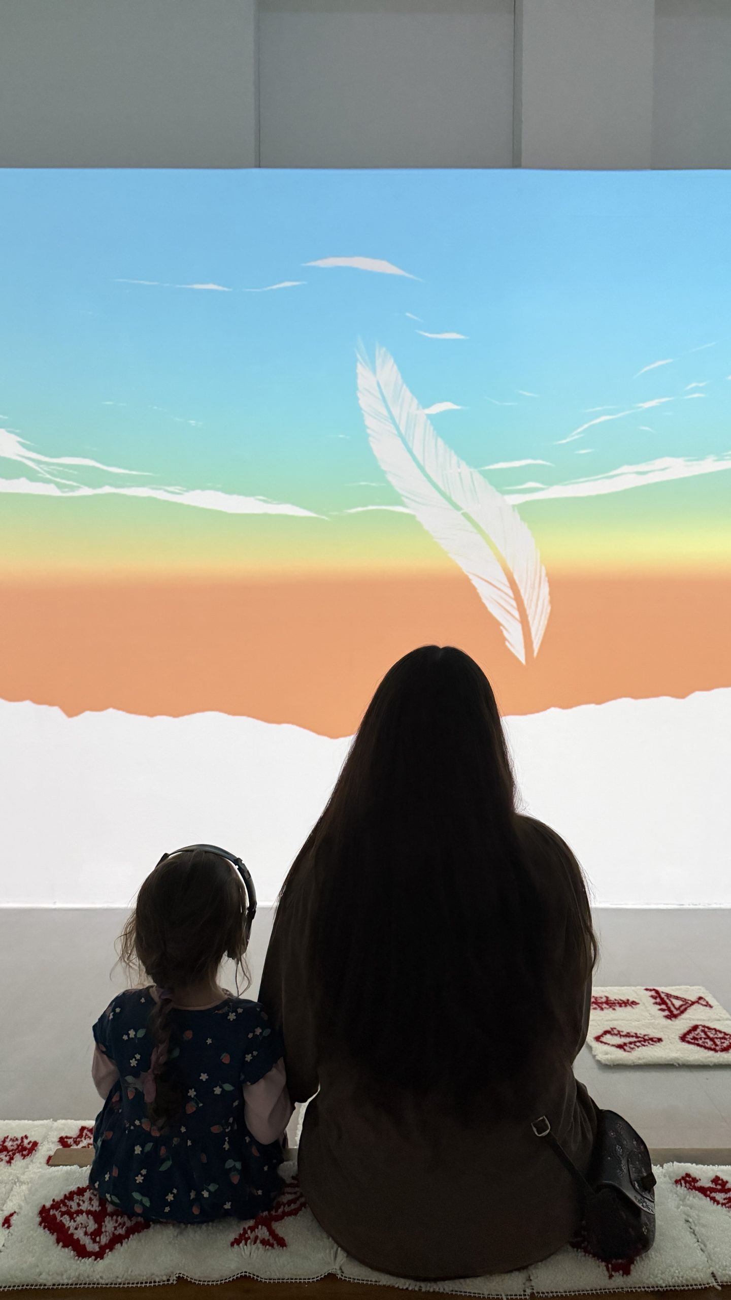
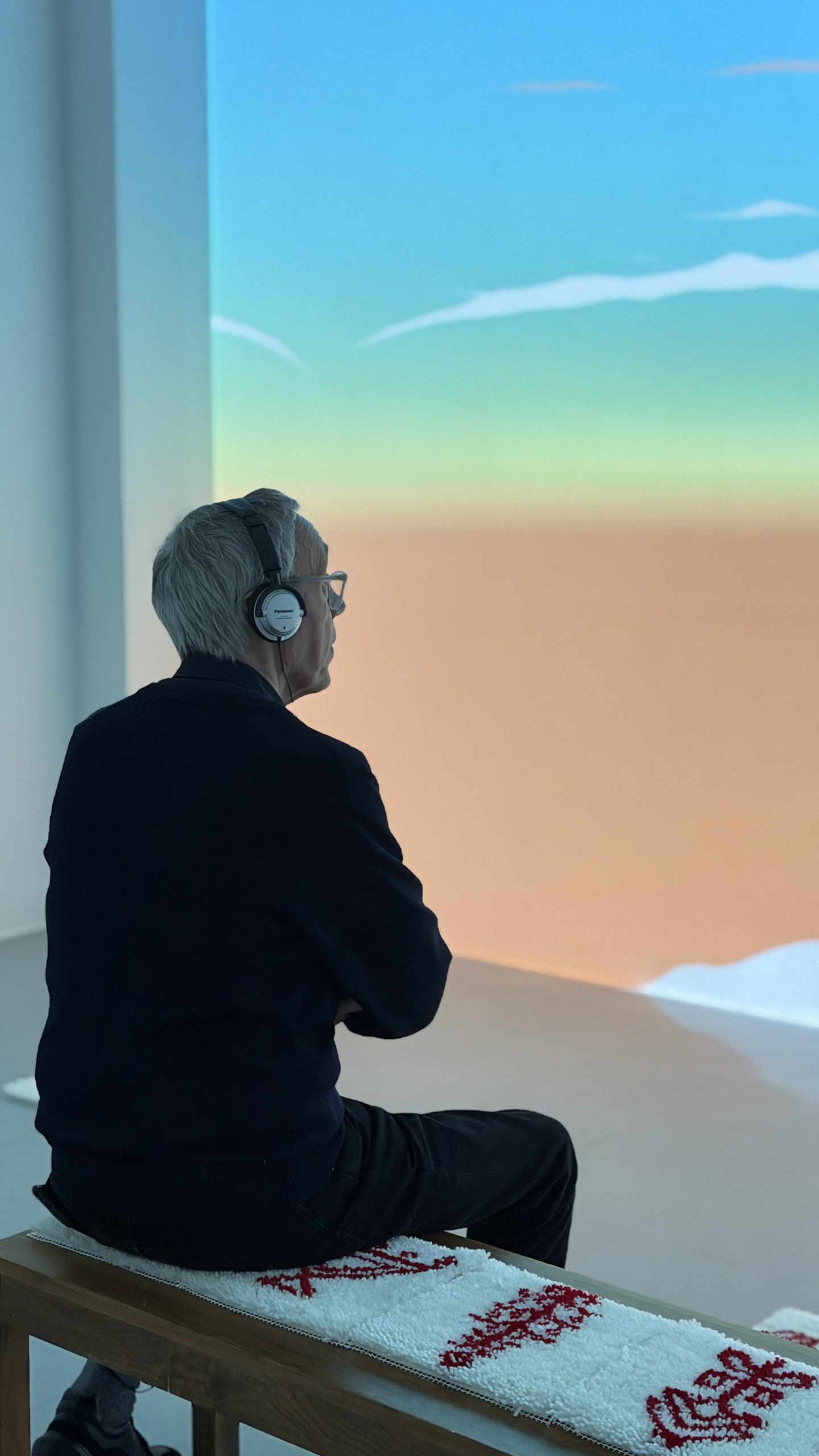
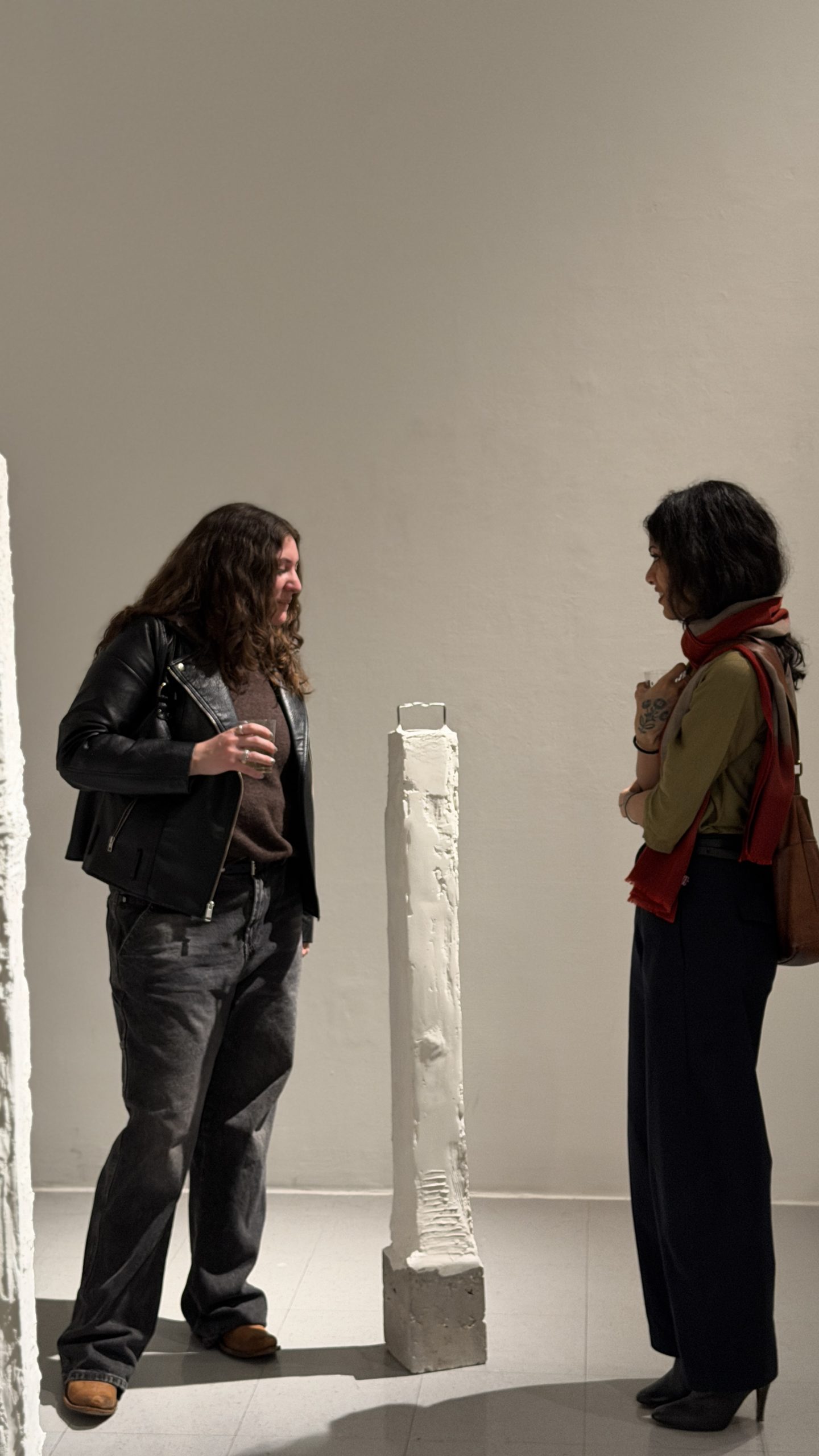
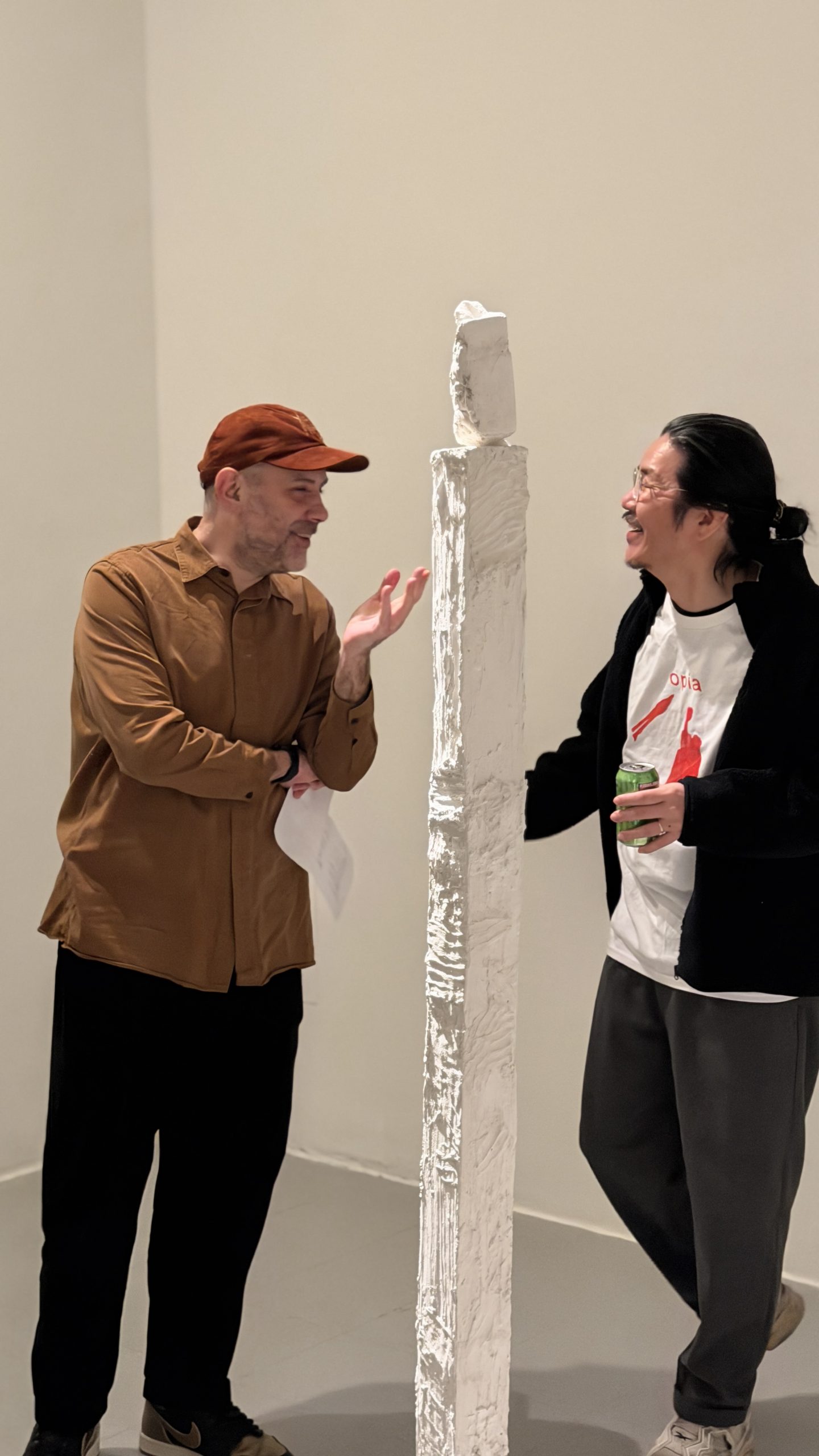
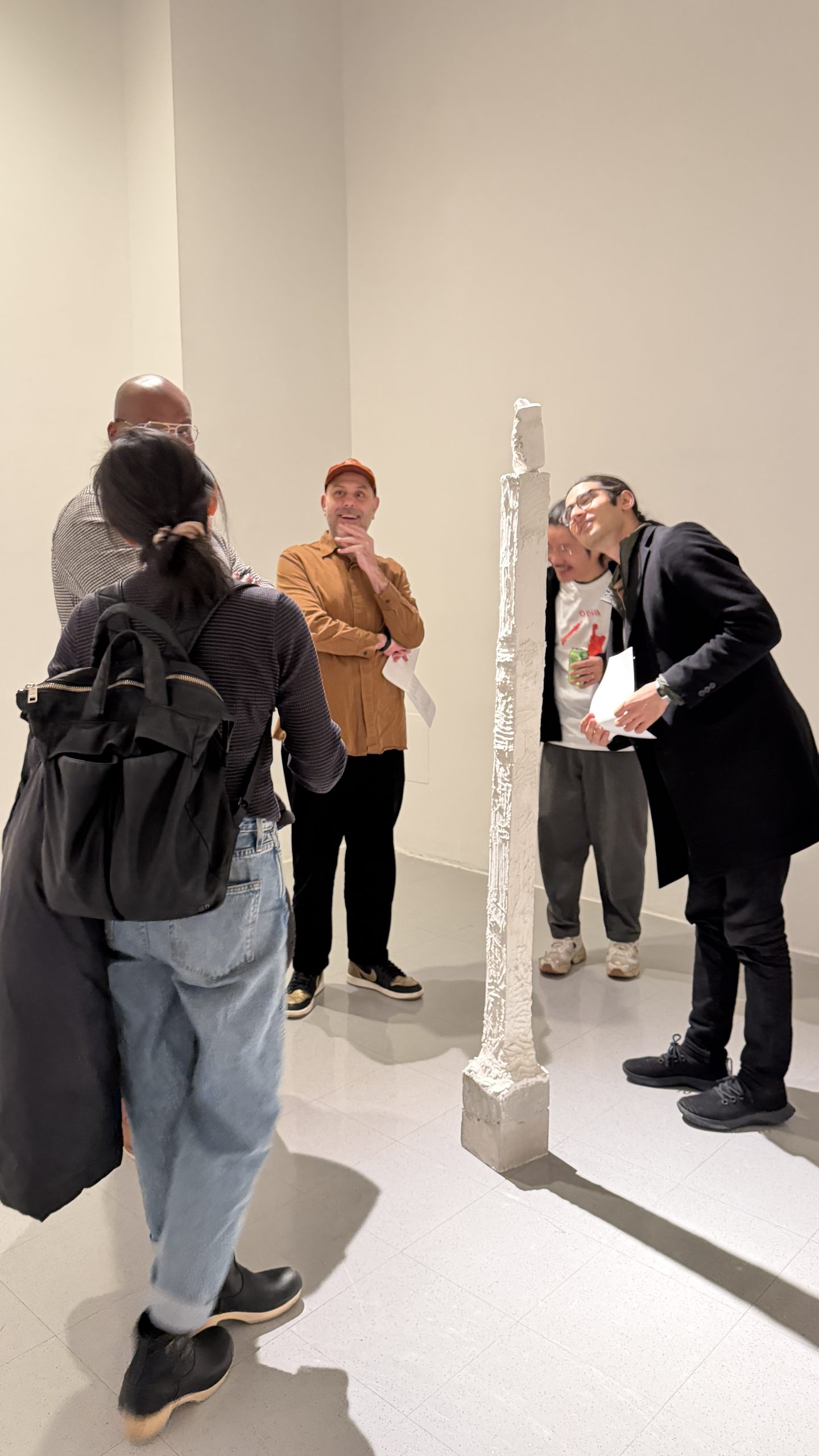
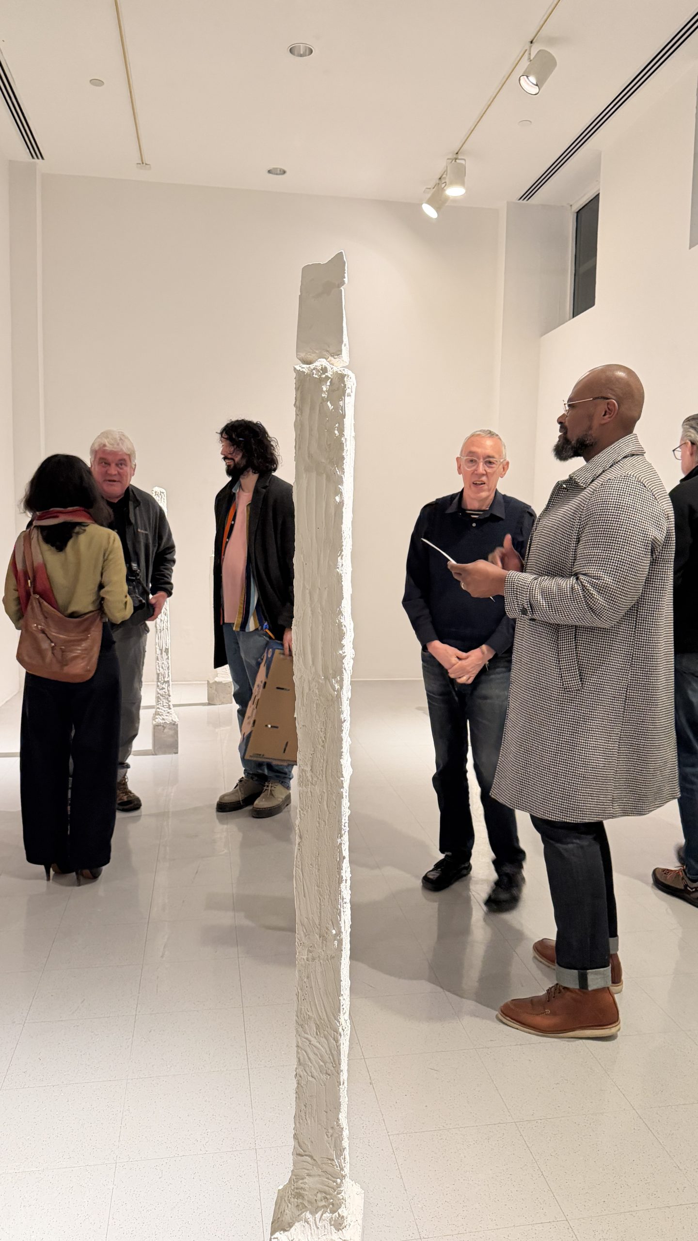
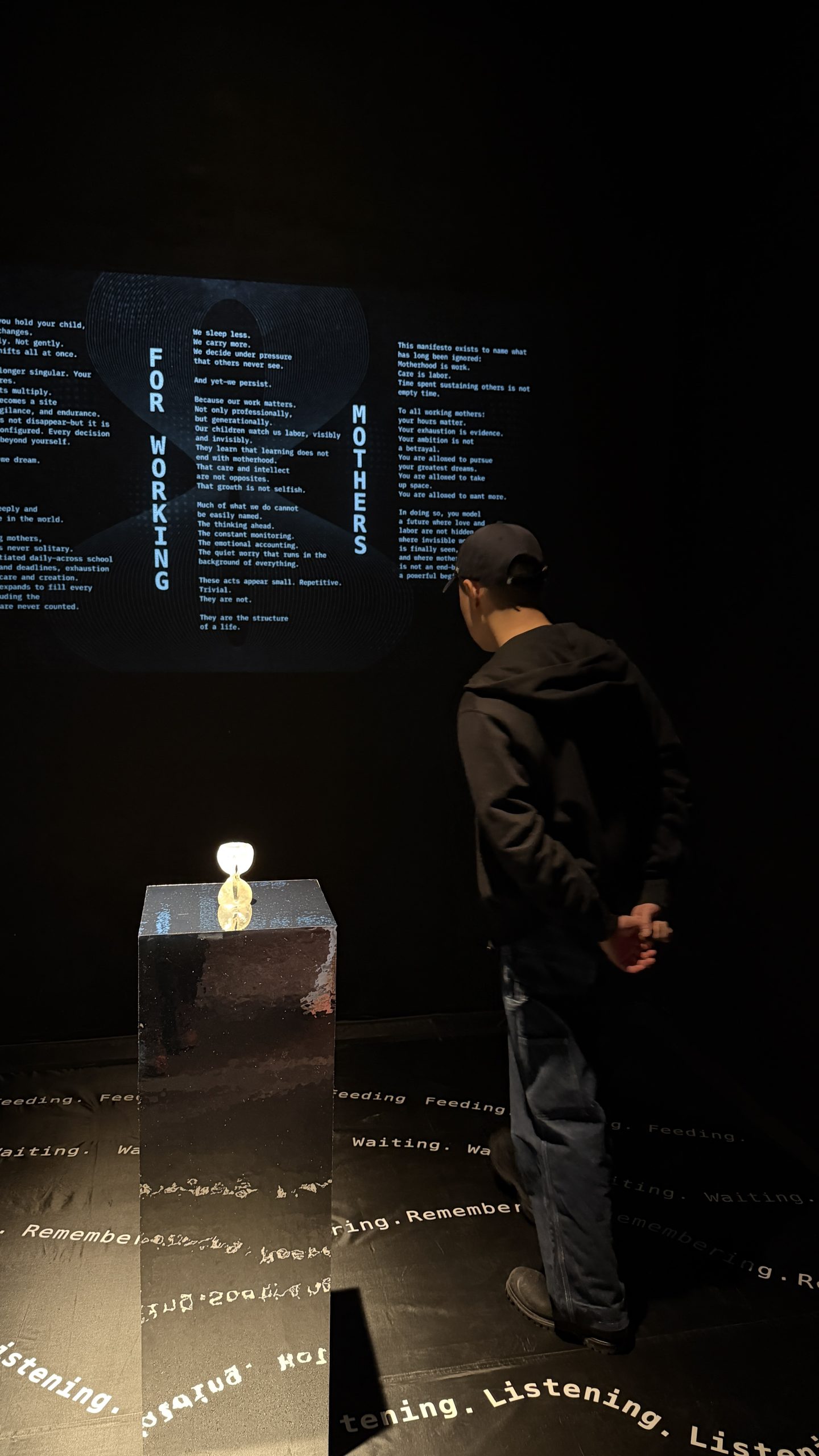
Throughout the field study, students used their phone cameras to observe and document “interactions”—the unintended or intended visual traces of human presence in spaces. Rather than documenting the monuments themselves. Back in the studio, these photographs served as the material for digital experimentation. Using Figma, the cohort translated the images into a tablet-based, interactive layout.
The game operates on a geometric repetition. At the beginning, the user selects one of three primary shapes: a triangle, a circle, or a rectangle. This choice initiates a path, requiring the player to follow the steps of the selected shape as it reoccurs, morphs, and embeds itself within the documentation of the UN space. By restructuring the field research into a responsive UI/UX system, the project challenges the boundary between passive observation and active navigation, architecture, and complex systems.
Special thanks to Atif Akin for facilitating this research expedition and taking photos.