illustration
Infographics
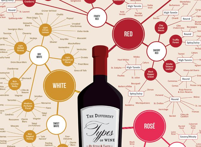
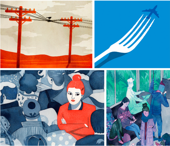
A huge and varied set of infographics collected by illustrator Otto Steininger.
P-O-R-T-R-A-I-T: The Artist Who Draws With Letters
by Atif Akin
Designer Roberto de Vicq de Cumptich has embraced the possibilities of using fonts to illustrate images.
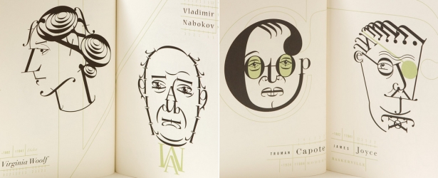
To the list of great fine-arts materials—clay and marble, oil paint and watercolor, and the like—it may be time to add an entry: fonts. At least, doing so would account for the career of Roberto de Vicq de Cumptich, a book cover designer and children’s author who makes typographic portraiture of famous authors from letters, numerals, and punctuation marks—using an inventive, playful method that draws from a history of inventive, playful portraiture.
His first children’s book, 2001’s Bembo’s Zoo (Henry Holt) began as a Christmas present for his young daughter. It’s an illustrated alphabet that shows children how to match letters and sounds with animal names. “I was trying to teach Portuguese to my then two-year-old daughter,” de Vicq, a Brazilian who’s based in New York, told me in an email exchange. “There were no bilingual alphabet books that we could use for both languages.” For examples, he pointed out, “A” is for “Alligator” in English, but in Portuguese the same animal is Jacaré. So he created his own abecedarium where each animal’s initial letter is the same in both languages.
“Since I consider myself a graphic designer, not an illustrator, the animals were fashioned out of a typeface called Bembo, the glyphs of which work very well both in large and small sizes—plus Bembo is a fun word for little kids,” he said. He restricted his animal portraits to being composed of only the letters in the animal’s name, and even made a typographical picture of himself instead of the typical, bland author photo.
The further potential of font-as-art quickly opened up to him: “After that, I started creating famous writer’s portraits out of different typefaces, in homage to the fact that letters are the basic staple of a writer’s work.” He limited himself to recognizable people, using only the letters (plus some punctuation glyphs) of the specific author’s name. The style of the typeface that he used needed to convey personality while suggesting the period in which the writer lived. Franz Kafka, for instance, was fashioned out of Ruzena Antiqua “to impart the feeling of Jewish woodcuts.” For Proust, he said the typeface Auriol expressed the French Belle Epoque. In 2008 these portraits were collected in Men of Letters and People of Substance (David Godine Publishers). He also used some of the same portraits in a promotional book and website for Adobe titled Words at Play.
“Part of the fun is to have a rigid set of limitations,” de Vicq said. “Otherwise, the decisions would become arbitrary and the work loses meaning. All the letters have to come from the writer’s name. The only two exceptions are that I allow myself to use the writer’s middle name (even though sometimes it might not be well known) and some punctuation glyphs of the same typeface to resolve some problems that a poor letterform can’t solve.”
While his methods are novel, De Vicq’s typographic imagery follows the tradition of the mannerist painter Arcimboldo, portraits of allegoric figures made from objects like fruits, vegetables and animals—though not type. Historical precedents for Bembo’s Zoo includes Curious George Learns the Alphabet by H. A. Rey and Margret Rey that play with letterforms to define aspects of animals (“A” for “Alligator” uses that letter as its mouth, for example). “Not exactly in the same vein, but with the same sensibility is the work of two of my design heroes Shigeo Fukuda and István Orosz,” he said, and indeed each figure exhibits a transformative surrealist mystique in their work.
It takes vision to imagine exactly how a human face will emerge from a jumble of digital typefaces. “At the start of each portrait, I am always afraid that it will not work, and sometimes they don’t,” de Vicq said. Failure occurs often because the writer has no single feature that defines their face – “or their name is too short.” He studies photographs, looking for defining features, then finds the most appropriate typeface for each personality. “I assemble all the letters of their name, both upper and lowercase, and I start playing.” Variations in type size are kept to a minimum, to create an even contrast. Some combinations don’t work: “I stay away of badly drawn type and from display typefaces that are too ornate or complicated.” But ultimately, there is a moment when everything fits together—like, say, the letters in a word.