Article on ‘Graphic Design: Now in Production’ on Governors Island on NY Times
By MARTHA SCHWENDENER
Published: May 31, 2012

A person working in almost any field could have written a book like “How to Be a Graphic Designer Without Losing Your Soul”: designers don’t have a monopoly on worker alienation, after all. But that title of Adrian Shaughnessy’s 2005 book reflects the special circumstances of graphic designers, who generally practice their art in the service of clients and commerce.
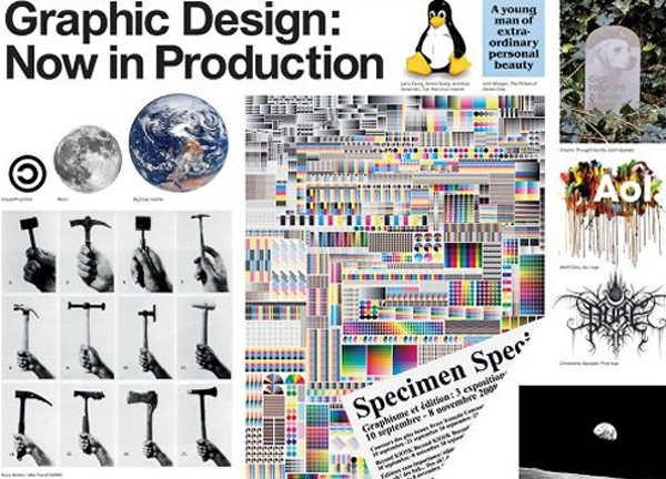
How much soul was or wasn’t lost in various acts of creation is not the ostensible point of “Graphic Design: Now in Production,” an exhibition, at Building 110 on Governors Island, of posters, books, magazines, typography, branding and film and television graphics created since 2000. And yet this theme underlies virtually every aspect of the show, which was organized by Andrew Blauvelt of the Walker Art Center in Minneapolis and Ellen Lupton of the Cooper-Hewitt, National Design Museum, and which vacillates between design made for industry and design that critiques it.
The catalog is oriented toward the latter, and toward a view of design as a force for social change. Inspired by “The Last Whole Earth Catalog,” a ’70s guide to off-the-grid living, it includes essays like Ms. Lupton’s “Designer as Producer,” a quasi-retooling of Walter Benjamin’s “Author as Producer” (1934) — which encouraged artists and writers to transform their mediums in order to turn passive consumers into active producers — and a piece by the Dutch designer Daniel van der Velden that includes an epigraph from Michael Hardt and Antonio Negri’s post-Marxist anti-globalization epic, “Empire” (2000).
Even some of the most corporate designs are displayed in a way that aligns them with counterculture. The wall label introducing Google Doodles, the changing home page logos of that Internet behemoth, describes how the first one, in 1998, was meant “as a message to users that the founders were ‘out of the office’ attending the Burning Man festival in the Nevada desert.” Examples here, shown on small video screens, include illustrated commemorations of Earth Day and John Lennon’s birthday.
A before-and-after display of redesigned corporate logos, including those of Pfizer and Starbucks, as well as the Library of Congress and the New York Public Library, incorporates a device recognizable to those familiar with contemporary art history: a polling system with plexiglass boxes in which viewers place chips to vote on their preferred versions. The display recalls Hans Haacke’s “Poll” art works, like “MoMA Poll” (1970), in which viewers were asked to register their opinions of Gov. Nelson A. Rockefeller, a MoMA trustee, and his position on the Vietnam War. (Mr. Haake has said the work essentially got him banned from exhibiting at the museum for the next three decades.)
Avant-garde practices also inform a series of posters created for the exhibition by the Amsterdam design firm Experimental Jetset. The works borrow heavily from the French affichistes of the ’50s and ’60s, who appropriated torn posters from the streets, and the ’70s British punk designer Jamie Reid, famous for his Sex Pistols record covers. A quotation from Walter Benjamin’s “Arcades Project” (1927-40) on one of the posters compares the experience of viewing a cluttered commercial landscape to reading while stoned on hashish.
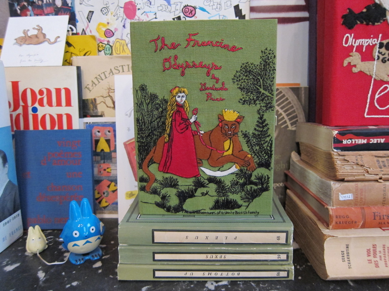
Books and magazines offer some of the most compelling designs here. David Pearson’s covers for books on the Penguin Press backlist, like Thomas More’s “Utopia” and Freud’s “Wolfman,” and Angus Hyland’s books of the Bible retool the canon for contemporary readers. Underground magazines like Manzine, The Gentlewoman and Sup Magazine spoof mainstream genres like men’s, women’s, and hipster-lifestyle magazines. Even typefaces, several examples of which are displayed on placards around the show, are treated as insurrectionary: Aktiv Grotesk, designed by Dalton Maag in 2010, is described as “a head-on challenge to the ‘over-hyped Helvetica.’ ”
Projects in which designers use their skills to turn information into more art-like objects and installations, away from the gaze of the client, make a more believable case for design’s radical potential. Kai Krause’s “True Size of Africa” (2010) is a map in which various non-African countries are fitted into an outline of the continent to offer a sense of Africa’s enormous size and, by extension, of its underrepresentation in geopolitics and world economics. Christopher Doyle’s “Identity Guidelines” (2008) is a series of self-portrait photos and texts that parodies fashion and personal branding, while the fake military patches that make up Trevor Paglen’s “Symbology (Volume I)” (2006) mimic the scary self-seriousness of classified intelligence units. “Facestate” (2011) by Dutch designers Metahaven is a canny if visually underwhelming kiosk installation that critiques social media as a method of surveillance and social control.
Works like these remind you that graphic designers possess a powerful skill set: the ability to persuade with images and text. What they actually do with these weapons of mass seduction is another story, however. The art critic Arthur Danto once suggested that American graphic designers helped win the cold war, since their products looked better on store shelves than their drab communist counterparts.
The subject of design in a utopian society is brought up in the catalog by Dmitri Siegel, who asks, “What would be the role of the designer in a truly do-it-yourself economy?” He offers Flickr, YouTube and MySpace as provisional examples; a series of eco-conscious Green Patriot Posters installed near the bathrooms suggests a darker, more dystopian view.
Within the exhibition context, design can easily be presented as utopian. It is striking, however, that from the building where this show is installed you can see, just across the water, the towers of Wall Street — a center of global capital, but also the physical and spiritual locus of the Occupy movement, which so far has barely tapped the radical power of graphic design.
“Graphic Design: Now in Production” is open weekends and holiday Mondays through Sept. 3 in Building 110 on Governors Island; (212) 849-8400, cooperhewitt.org.
A version of this review appeared in print on June 1, 2012, on page C21 of the New York edition with the headline: Design in the Service of Subversion.


