Dimensionism.Space

Dimensionism: Modern Art in the Age of Einstein, on view at the Zimmerli Museum through January 5, 2020, is a groundbreaking exhibition that explores how modern art was influenced by advances in science, from Einstein’s theory of relativity to newly powerful microscopic and telescopic lenses.

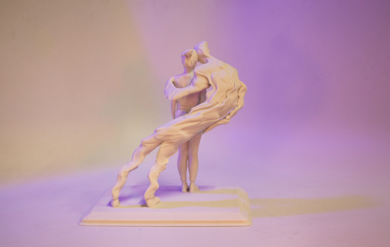
Dimensionism.Space is a microsite conceptualized, designed and developed by the Design Practicum Fall 2019 class at the Art & Design department at Mason Gross School, Rutgers University, New Brunswick, on the occasion of this exhibition. The Designers in this class wanted to promote this seminal exhibition across the campus through a contemporary and computational lens by way of reflecting on the work of their choice and creating a digital avatar or a tribute to that in the form of code and its visual reflection. This microsite is designed and produced by, Jennifer Aguirre, Elyssa Feerrar, Conor Finn, Lau Krystal, Tyler Lee, Kathleen Makar, Jillian Mulhern, Rushika Raman, Sara Reed, Francesca Stoppa, Maya Tillman, and the project is mentored by Donna Gustafson, Thomas Sokolowski and Atif Akin.

Design Practicum @ oldweb.today

Going into our senior and junior years of design school, it was exciting to be able to work on a project that had as much cultural and professional significance as Rhizome’s Oldweb.Today internet archive. The archive pulled from historical sources dating as far back as the early 1990s to provide an interactive experience that approximates the experience of using the historical internet.

This project provided the opportunity to tackle various design problems in a real-world scenario in a way in which they could be understood and implemented in relation to one another. The challenges of this project encompassed everything from visual identity and branding to the user experience and interface design. During the course of the project, we spent time moving between groups each of which took a distinct approach to and interpretation of what an internet archive would look like in 2019.

We proposed three different visual identity systems and UI/UX scenarios with different code names that are all now under consideration by the design and development team of Rhizome. UI/UX scenarios are either developed on the front end or represented through mock-ups.

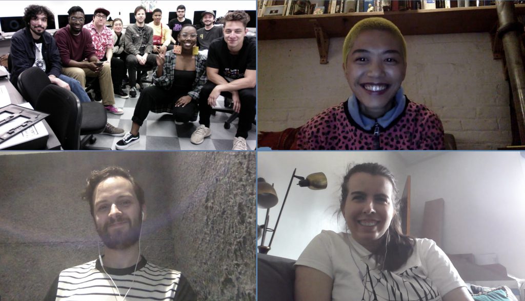
Throughout the process, we had multiple remote online real-time interactions with the Rhizome team, Pat Shiu, Lyndsey Jane Moulds and Mark Beasley and then had to chance to visit them at the New Museum for the second presentation of the project.


Solitaire

Working in the solitaire group we created a multi-surfaced mockup to help create better separation of information. This interface was based more on a retro look and used brighter colors to make the experience feel more light and fun. Solitaire’s color selection was based off of Rhizomes RGB color palette and other added colors stayed with the same tones. We created a new hierarchy for the timeline that better explains how the browsers work and what is the most optimal browser for the site and time you are searching. In the early stages, we decided that tabs like “commonly searched sites” and “user guides” would be helpful for people who are new to the site and may not have an idea of what to search first as well as to give a background of the website and help troubleshoot problems. 

The design of the interface of this approach emphasized the efficiency and accuracy of the tools that it provided users over simplicity or seamlessness. When designing the user interface, we tried to focus on the chronological flow of user inputs that were required to request a webpage from the archive.


The branding of this page was based on the concept of popup windows layering on top of each other; an effect that was common in the early days of the internet with its lax security standards and primitive advertising techniques.

The colors were taken from the Rhizome glitch effect, evoking that same feeling from the initial company to their product. These colors were also expanded to the whole website creating a more out there stark design that can be contrasted to their more subtle approach.

Dot.

Oldweb.Today, ya can’t have it without the dot. 
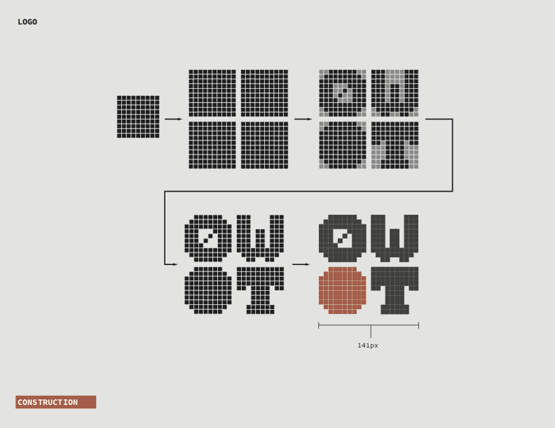
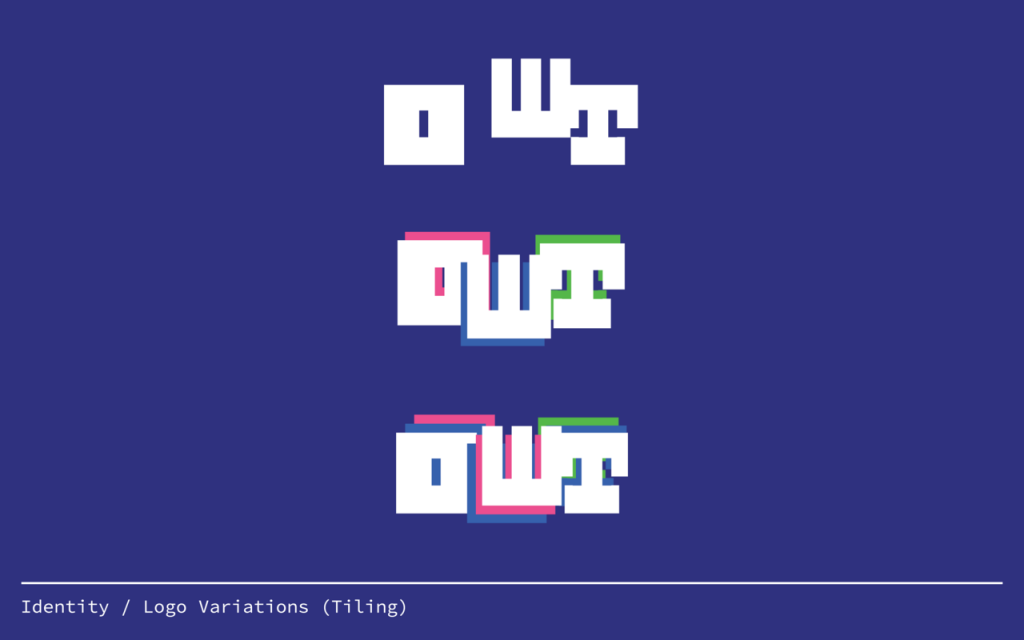
Based off a 10×10 grid, our logo speaks both to the history of the web, as well as OWT’s origins in New York. Through systematic removal of pixels, the letterforms become less choppy as they go from O to W to T, bringing the old web to today. The colors of the site are muted and largely greys to allow the emulated content to be the main focus. Typefaces were handled in a similar way, using simple fonts that don’t dominate the screen and are easily legible. 
Our goal in the UI was the accessibility and ease of use. Through an intuitive calendar-like timeline, users can be sure their searches are accurate. Once all the information has been selected, users are drawn to the emulated browser that takes up much of the screen.

Much of the idea behind the Dot logo and its branding has to do with systems, and how they work. The logo itself was rendered by following a set of rules. Our approach was reductive and somewhat minimalist in how we felt functionality should be emphasized instead of decoration. A strength of the finished product is how it speaks to internet functionality of both the past and present, no matter what time period.

Web.Safe

The goal of this web space was to bring the slick design of the modern world to the passing fun and in your face aesthetics of the late 90s/early 2000s. Contrasting between old school fonts, web safe ties together the past and modern present into a GIF-able to be transformed and separated by a time loading hourglass further delineating the past, present, and future.

The idea for the brand identity for web-safe revolves around juxtaposing six of the original web-safe fonts like Arial, Palatino, Impact, Verdana, courier new and Comic Sans with a more modern one (in this case Roboto). The “.today” part of the logo stays in Roboto while the “OldWeb” half constantly changes into one of the six web-safe fonts. The dot that separates the two halves shows a Windows 98-era hourglass icon. There are possibilities for rapid animation of the logo or perhaps randomizing which font shows up for its first half upon refreshing the page or re-entering the site.

Neue Machina was chosen as a secondary font to be used for the printed matters of Oldweb.today, due to the deep ink traps that give it a mechanical and industrial aesthetic, yet rendered beautifully in ink.

The choice of a black, white, gray, and an HTML blue color palette stemmed from the default hyperlink blue that stems from the old web, and still can be visible in non-updated websites. While keeping the palette monochrome with one color standing out, this renders the attention of the audience to focus on the content as opposed to making a grander design.

Practicum Class of Spring 2019

Jeffrey Gardner
Daniel Gilmartin
Weronika Korzec
Tyler Lee
Joel Novas
Fred Quayenortey
Matthew Simonetti
James Zerilli
Sarah Rim
Ana Filomeno
Senary Chapman
Richard Siggillino

Bunker Gallery

OPENING MARCH 3

BUNKER is a pop up art gallery specializing in emerging artists who create engaging, beautiful work that often involves technology. 

BUNKER operates under the assumption that art doesn’t have to be inaccessible and pretentious in order to be valuable. 

BUNKER is a gallery for people who hate technology but love art.

BUNKER is a gallery for people who love technology but hate art.

BUNKER is curated by GABEBC

Job Opportunity: BARD Graduate Center

In case any of you know someone who is looking for full-time work:

Junior Designer- BARD GRADUATE CENTER
The Bard Graduate Center (BGC), a division of Bard College located on West 86th Street in New York City, is seeking a full-time Junior Designer.
Founded in 1993, the BGC is comprised of an Academic Program, Research Institute and Gallery. We offer MA and PhD programs in the study of the cultural history of the material world and are committed to the encyclopedic study of things, drawing on methodologies and approaches from art and design history, history of technology, philosophy, anthropology, and archaeology and cultural history.
The world renowned Gallery organizes four exhibitions during the academic year. Our exhibitions examine the material evidence of cultures extending from ancient world to the present inclusive of Africa, the Americas, Asia, and Europe. Each exhibition is accompanied by a scholarly book published in collaboration with, or distributed by, Yale University Press.
JOB SUMMARY:
Reporting to the Art Director, the Junior Designer will divide their time between design responsibilities and design support responsibilities. Design tasks include work for print, digital, and signage projects. Support includes maintenance of the BGC website, responding to varied web update and small print needs from around the institution, and managing supplies and digital files for the Art Department.
CHARACTERISTICS, DUTIES, & RESPONSIBILITIES:
• Design and assist in the creation of print materials (ads, posters, brochures, exhibition related ephemera, and exhibition books)
• Produce BGC stationary and paraphernalia (business cards, tote bags, etc)
• Daily upkeep and administration of the BGC’s website via a content management system
• Support Website Manager in maintaining social media feeds
• Photograph and video BGC events.
• Other duties as assigned

REQUIRED QUALIFICATIONS:
• Design Skills, demonstrated by a portfolio
• InDesign, Photoshop, Illustrator
• Basic HTML and CSS; familiarity with coding for HTML emails a plus
• Experience with print production
• Basic photography/videography skills
• Ability to code for WordPress a plus
To apply, please submit a cover letter, resume and contact information for three references to dd@bgc.bard.edu. No telephone calls please. The Bard Graduate Center is an equal opportunity employer and we welcome applications from those who contribute to our diversity. AA/EOE

Language & Enrichment Center: Graphic Design Intern Needed

The Language and Enrichment Center: Graphic Design Internship
Contact: Stephanie Malke, lecpersonnel@gmail.com
Start Date: Immediately
Type: Unpaid Internship, For-Credit
Location: Scotch Plains, NJ
Description:
The Language and Enrichment Center is a non-profit learning center for young children, whose primary focus is to teach children the Italian language and culture. They are seeking creative and talented graphic design interns with basic to intermediate knowledge of website management, designing marketing materials, app design, social media management, and public relations. Interns will design, maintain, and update websites regularly, increase company presence through web optimization, and assist with visual media. Basic knowledge of Photoshop, Illustrator, AppleMac, and web creation programs is a requirement. Qualified student must have the following skills: Microsoft Word, Excel, PowerPoint, strong analytical skills, standard troubleshooting, communication, organizational, and strong creative design skills.

TO APPLY:  Please e-mail resumes to guyclec@hotmail.com