design
“The Winners and Losers of History: The Emergence of Japanese Modernism in Graphic Design”
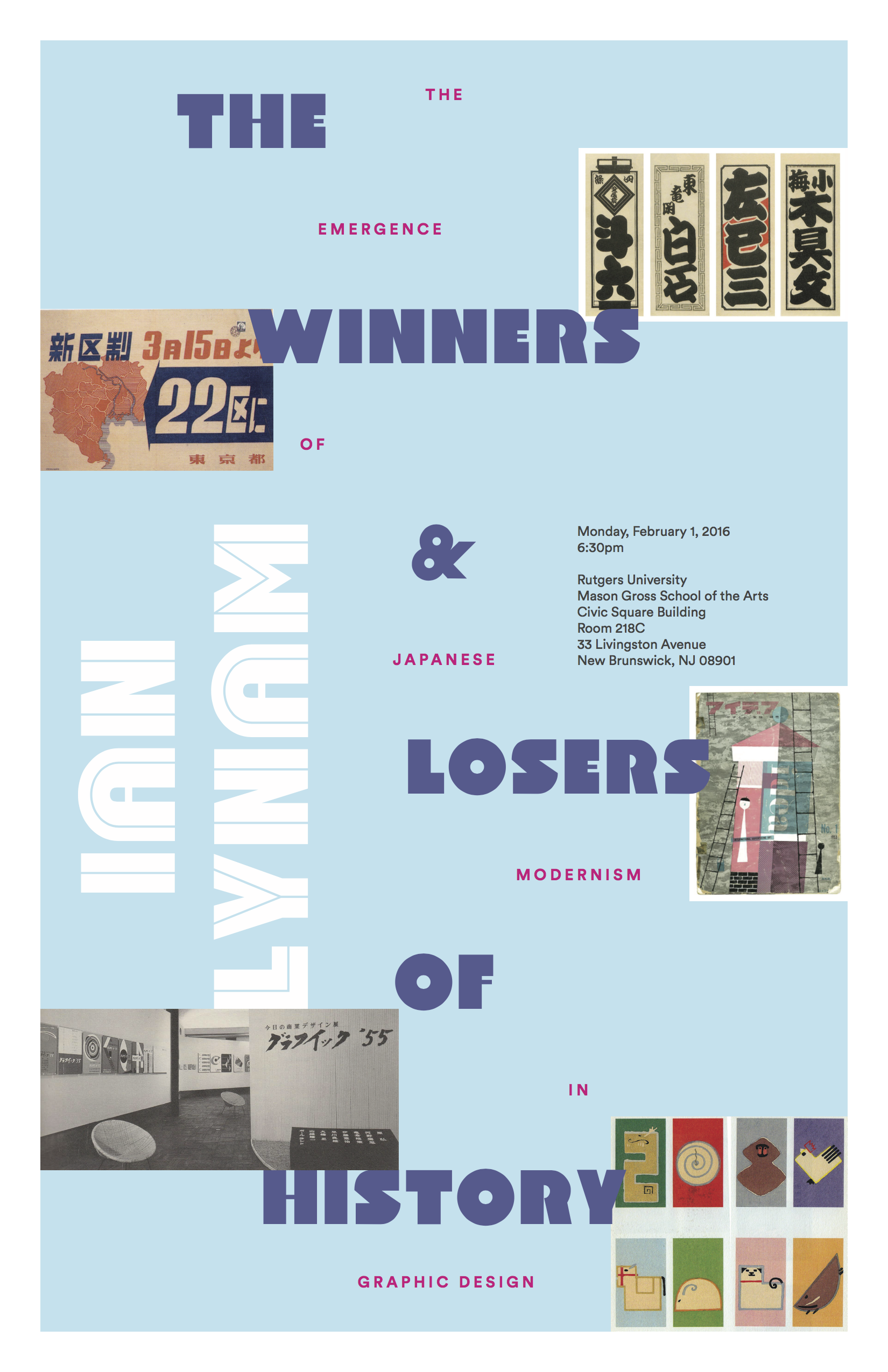
On Monday evening Jason’s Seminar in Design class will be hosting a guest lecture by Ian Lynam, a Tokyo-based designer, educator, and writer. Ian will be presenting on “The Winners and Losers of History: The Emergence of Japanese Modernism in Graphic Design”. Here are the details and a bio:
Monday, February 1
6:30–8pm
Room 218C
Originally hailing from New York, Lynam has a BS in Graphic Design from Portland State University and an MFA in Graphic Design from CalArts.
Ian Lynam is Chair and faculty at Vermont College of Fine Arts in the MFA Graphic Design program. He is faculty in Tokyo at Meme Design School. Ian is also adjunct faculty at Temple University Japan. There, he teaches in the Undergraduate program, actively engaged in developing curricula concerning typography, graphic design, image-making, identity design, UI/UX and motion graphics.
Currently, Ian writes for Idea Magazine(Japan) and Slanted Magazine(Germany). He is a co-founder of Néojaponisme, a critical cultural online journal.
Dear Design Student
Why is so much of design school a waste of time?
by Juliette Cezzar
Q: My teacher hates everything I make, even though I spend all this time working on it, and gets mad even when I follow his advice. Sometimes designers who are working come to talk to us, but they never get what I’m trying to do. There’s all this useless talking when they should just teach us things. Should I just quit school and go work somewhere? I feel like this is a waste of time.
Dear design student,
Sure, you can leave, but you’re going to take your inability to use criticism with you. And then you will be back here in about six months asking why your clients keep getting in your way or whether or not you should go find a better job with smarter people. So my advice is that if you can, stay where you are for as long as it takes for you to figure this out. You don’t have to go to school to figure out how to give and receive criticism, but it’s mostly what happens in school, so it’s a good place to practice.
I was terrible at it, so I didn’t even begin to figure it out until I was halfway through graduate school. Critics would come up from New York and the most I could get out of them were expressions of sympathy or open frustration. They would get away as soon as it was politely possible and sneak back to the desk of my then best friend and mortal enemy, scribbling down their phone numbers and breathlessly asking if they could talk more with him later.
This made no sense to me. Especially early on, his work was half-baked and sometimes awful. But over two years, he became ten times the designer he was when he started, while I was pretty much in the same place. And I watched him do it. When people came to his desk, everything about his expression and body language said “tell me more,” as if the critic was spoon-feeding him ice cream rather than telling him everything that was wrong with his work. As for me, I was set on being me, which meant tearing the work apart before anyone else could, offering up detailed excuses to fill the time, and arguing with my critics, building my case that I was smarter than them anyway, since they clearly didn’t get what I was doing. And I spent the rest of my time complaining that maaaybe ten percent of what they said was useful, when in my mind, the yield should have been far closer to one hundred percent.
So here’s the secret that I didn’t put into practice until after I graduated: you’re a gold miner, not a customer, and if you don’t get good at mining for gold, you will never be a good designer. Especially once you make it past the first year or two of working, you spend less time wrestling with making things and more time listening to people in person, on the phone, in slack, in texts, in email, pretty much everywhere where they can find you. They are redundant, inarticulate, inefficient, vague, and inconsistent, and they are constantly going on and on about something. And god bless them. They don’t owe you clarity. If ten percent of what they say is useful, that’s a win. Your job as a student is to practice figuring out which ten percent is useful, how to mine it, and how to use it. This is what school is for. If you want to learn how to use digital tools, talk to the internet.
You’re also thinking here that success in a critique means that people like what you made, and that success in the next critique is showing how obedient you are in following their suggestions. You’re missing the point. It’s a gift exchange, not an oral exam, and if you don’t get past this in school, you will be condemned to repeat it after you leave. You’ll go to one client meeting and walk out mad that they didn’t like what you made, then you’ll grumpily make their suggestions real and bring them in for the next round, and get mad again when they still don’t like it. You will complain to your friends about “pushing pixels” and how dumb clients are. And you will be as good a designer at 32 as you were at 22, maybe slightly worse.
You have to let go of sorting people into “good” people who like what you do and “bad” people who don’t, and you have to start to seek out people who don’t see things exactly as you do. The hero in your life is never going to be the person who pats you on the head: it’s going to be the person who puts their own need to be liked aside to make you a better designer. And no, someone doesn’t need to understand you or your project 100% before they have the right to say anything about it. The person who doesn’t get you or what you made is the one that is most likely to come up with the idea or the insight that you can’t come up with on your own. People who see things differently are gold.
So next time someone is giving you feedback about something you made, think to yourself that to win means getting two or three insights, ideas, or suggestions that you are excited about, and that you couldn’t think up on your own. Lead the conversation until you get there. Ask real questions that tell you something that you didn’t know already. Say “tell me more.” Let them wander, tell stories, not understand, be irrelevant — take as long as it takes to listen for the pieces that make you better.
And if they are hard on you, keep coming back to them. As my favorite client once said to someone working for him, “Is this it? Is this as good as you want to be? Are you done? Because if you are done, and you don’t want to be any better, I can stop talking. But if you’re not, I’m here for you.”
Juliette Cezzar is a designer, educator, and author based in New York City. She is currently the Associate Director of BFA Communication Design at The New School’s Parsons School of Design and President of AIGA/NY. Her most recent book, with Sue Apfelbaum, is Designing the Editorial Experience.
Information Fall-Out: Buckminster Fuller’s World Game extended
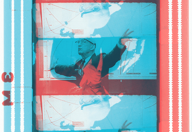
Film stills courtesy of the Herbert Matter World Game Archive at Stanford University Libraries.
Columbia University Graduate School of Architecture, Planning and Preservation
Information Fall-Out: Buckminster Fuller’s World Game extended
September 18—November 20, 2015
Arthur Ross Architecture Gallery
Buell Hall, Columbia University GSAPP
1172 Amsterdam Ave
New York, NY 10027
Hours: Monday–Friday noon–6pm, Saturday 3–6pm
Columbia GSAPP Exhibitions presents Information Fall-Out: Buckminster Fuller’s World Game, an exhibition at Columbia University’s Graduate School of Architecture Planning and Preservation.
Initially proposed for Expo 67 in Montréal, Buckminster Fuller’s World Game was played for the first time in 1969 at the New York Studio School for Drawing, Painting, and Sculpture. Over the next decade, the World Game evolved and expanded through workshops, seminars, strategy papers, and building designs. Across its different manifestations, the World Game remained focused on the goals of overcoming energy scarcity and altering conventional territorial politics through the redistribution of world resources. This anti-Malthusian, anti-war game was meant to discover conditions for perpetual ecological peace and to usher in a new era of total global resource consciousness. Mirroring Cold War command and control infrastructures, proposals for World Game centers described a vast computerized network that could process, map, and visualize environmental information drawn from, among other sources, Russian and American spy satellites. Fuller claimed that their optical sensors and thermographic scanners could detect the location and quantity of water, grain, metals, livestock, human populations, or any other conceivable form of energy. Among Fuller’s abiding obsessions was the limited range of the electromagnetic spectrum available to human vision. Fuller argued that the World Game would serve as a corrective to this limitation by rendering visible global environmental data patterns that evaded normal perception.
Assembling documents related to various iterations of the World Game conceived, proposed, and played from 1964 to 1982 along with materials from the World Resources Inventory, the exhibition examines the World Game as an experimental pedagogical project, as a system for environmental information, and as a process of resource administration. A related symposium will bring together scholars and architects with Fuller partners and collaborators to speak about the World Game in relation to its ecological, informational vision, and to the current stakes for environmental data and its representation.
The exhibition is curated and designed by Mark Wasiuta, Director of Exhibitions and Co-Director of the Critical, Curatorial, and Conceptual Practices in Architecture Program, and Adam Bandler, Exhibitions Coordinator at Columbia GSAPP. Florencia Alvarez Pacheco is assistant curator.
For more information, please send an email to exhibitions@arch.columbia.edu.
The Arthur Ross Architecture Gallery at Columbia University’s Graduate School of Architecture, Planning, and Preservation (GSAPP), provides a platform for developing original curatorial projects and for experimenting with the spatial distribution and visual organization of research material. The gallery is simultaneously a testing ground for exploring new approaches to architectural exhibitions, and a space for considering and analyzing architecture as it has been formed through exhibition. Its exhibition program follows several distinct series. “The Living Archive” interrogates and exposes important and underexamined architectural archives, while other exhibitions resulting from collaboration with contemporary artists, architects, and scholars aim to provide models for novel forms of architectural speculation and spatial practice.
Bierut Show in NYC — Must See Before Nov 7!
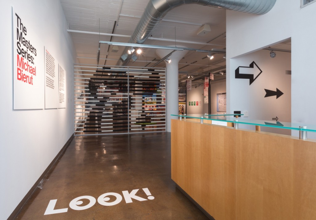
Make sure to see Graphic designer Michael Bierut’s exhibition at the SVA Chelsea Galleries, up now through Nov 7. You will see a coherent body of thoughtful work, including logos, visual identity systems, posters, books, way-finding and building signage, as well as pages from the designer’s sketchbook, a video interview and a roomful of black-and-white posters for the Yale School of Architecture. Absolutely gorgeous! Read an interview with the designer here.
Design Interactions Studio at MoMA
October 21–November 14, 2015
The Lewis B. and Dorothy Cullman Education and Research Building, Mezzanine
Wednesday, Thursday, Friday, and Saturday, 1:00–5:00 p.m.